
Bookr
Introduction
Context
The Bookr project was a semester long undertaking for an HCI Design Foundations class, wherein a team of HCI students worked together to identify a user group and need, research that group, and design a solution to improve a pain point or problem the users experience. The focus of the project was on executing the entire design process from ideation and research all the way to usability testing.
Overview
Through the process outlined below, our team selected the user group of “amateur musicians” with the need of “wanting to leverage their skills to make money.” This led us to execute interviews and surveys, that informed 3 divergent design solutions (‘Bookr’, ‘GigExplorer’, and ‘TourBuilder’), which were eventually narrowed down to the single Bookr solution (a mobile app to connect musicians with venues) and refined that design into a testable prototype which was used to execute usability testing and plan for future iterations.
Contribution
Besides myself, my group consisted of three very talented individuals from a variety of backgrounds ranging from psychology, to industrial design, to data visualization and computer science. While we each brought our own strengths to the table none of us were experts across the board and our focus throughout the project was to learn how to execute proper design methodology, to this end we all contributed fairly equally to most aspects of the project.
However, there were a few things I found myself specializing in, these often included the UX architecture and communication heavy aspects of the project from guiding our group discussions and whiteboarding to report writing and agenda planning to sharing data and project updates with our professor and TA, and presenting our project poster at an informal design showcase. Within the framework of this group, I thrived at the head of the table, asking questions, consolidating information, and prompting others to share their ideas and voices.
Process
Method: Problem Space Brainstorm
Goals + Justification: Identify an interesting user group and some possible challenges they may face. This user group had to be easily accessible to us for research, experience a variety of possible pain points in their regular life, and provide an interesting enough scenario that we would enjoy working with it for a semester.
Synthesis + Findings: Through rapid whiteboard brainstorming we were able to come up with over 30 different user groups/problem spaces. By working together as a team, we narrowed those ideas down to a single user group and need: “amateur musicians who want to leverage their skills to earn money”. As an added bonus, this activity acted as one of the first ice-breaker and team bonding exercises we would perform. It set the stage for a semester of effective open communication practices and many future group discussions.
Contribution: This was my first experience as ‘the whiteboard guy’ in the group and I instantly fell in love. I enjoyed driving the discussion with questions, encouraging everyone to come up with abstract ideas while reinforcing that there were no wrong answers or bad ideas in this phase. This is definitely a strong suit in my skills toolbox.
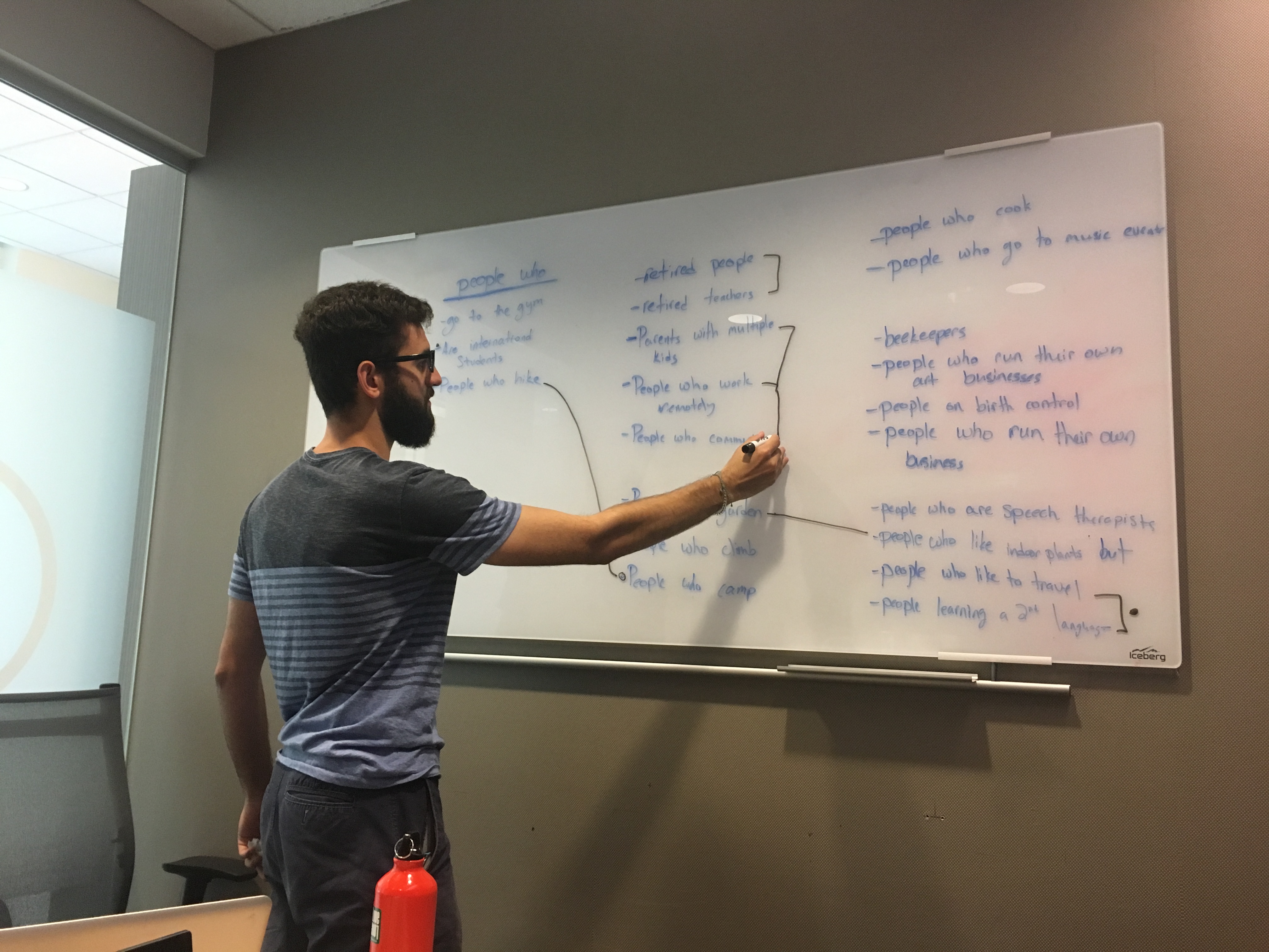
Me, working on the whiteboard to combine and elminate problem space suggestions.
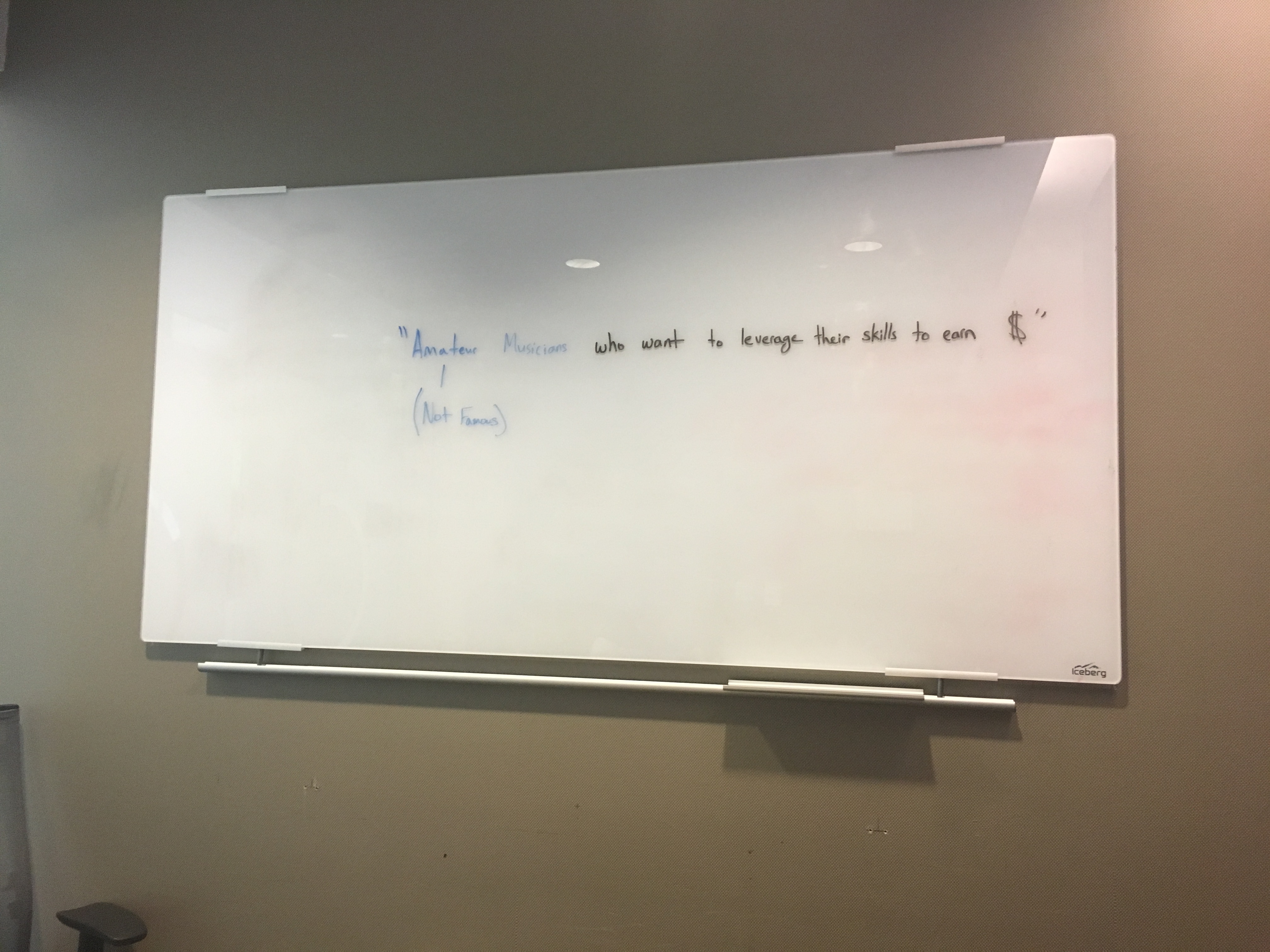
The final definition of our general problem space.
Method: Defining User Attributes + Design Implications
Goals + Justification: Get into the minds of users and think about the physical and mental attributes our target audience would bring to the experience of any product we create. These would then be translated into concrete design implications that would be considered when defining affordances in every step for the rest of the project.
Synthesis + Findings: We determined 19 distinct ‘User Attributes’ for amateur musicians, ranging in category from physical, to social, to cognitive, and perceptive. These included things such as “possible hearing loss from loud live performances” to “familiarity with musical concepts and terminology.” These were translated into concrete design implications of varying importance and referenced when making design decisions throughout the project.
Contribution: This was done as a group activity in a shared Google doc. It’s hard to define if any one person had the strongest contribution in this phase, although I did find a personal communication strength in turning the more abstract attribute concepts into easily comprehensible words.
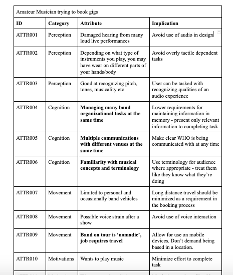
A glance at some of the user attributes and design implications we defined.
Method: Semi-Structured Interview (x3)
Goals + Justification: Talk to actual users in order to gain a real understanding of the problem space which would help inform us as to the various challenges and pain points that exist for musicians. This information would lay the foundation for what questions we should be asking as we proceed, how to define our goals and success parameters, and most importantly help us focus our efforts on a narrower problem definition that we would be able to research and solve.
Synthesis + Findings: After interviewing musicians from a variety of backgrounds and comparing their responses in a comprehensive sticky note breakdown session, we learned a lot about the general process of being a performing musician, what mental models they used, their tools and practices, the assumptions they make, and some general lifestyle problems and challenges. Most importantly, we discovered a universal pain point that can best be summarized as, “the process of finding and booking gigs”. This would be the foundation for our efforts going forward as we decided this was an interesting problem and, that if we could solve it, we could add a lot of value to our users’ experiences.
Contribution: I wrote a significant portion of the interview script and conducted the first interview by myself. My experience and feedback helped tweak the script for the next two interviews by changing the order and phrasing of certain questions and adding others that I had improvised during my conversation with the interviewee. I also discovered a natural skill and enjoyment in teasing out the key information from users and digging deep with follow-up questions to intriguing answers where essential insights that were hidden below the surface.
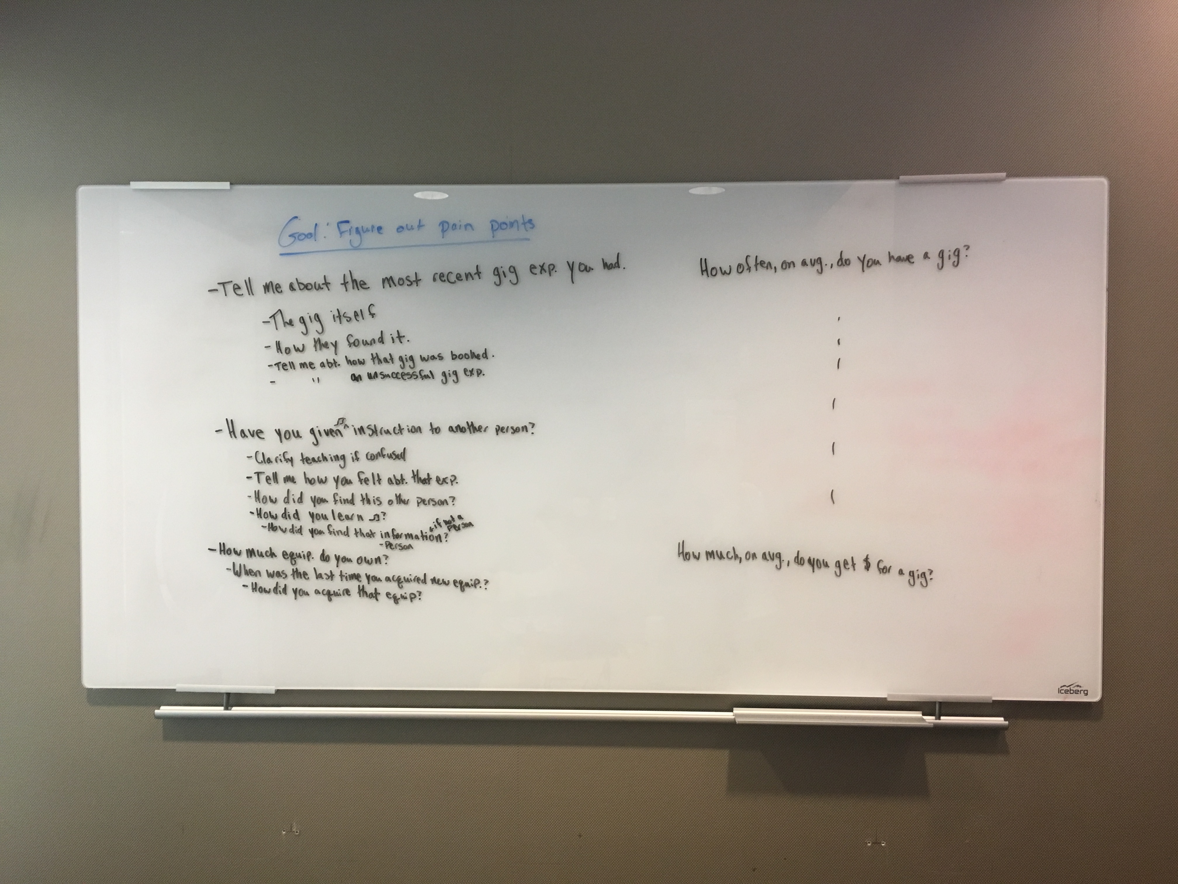
A preliminary outline for our interview script.
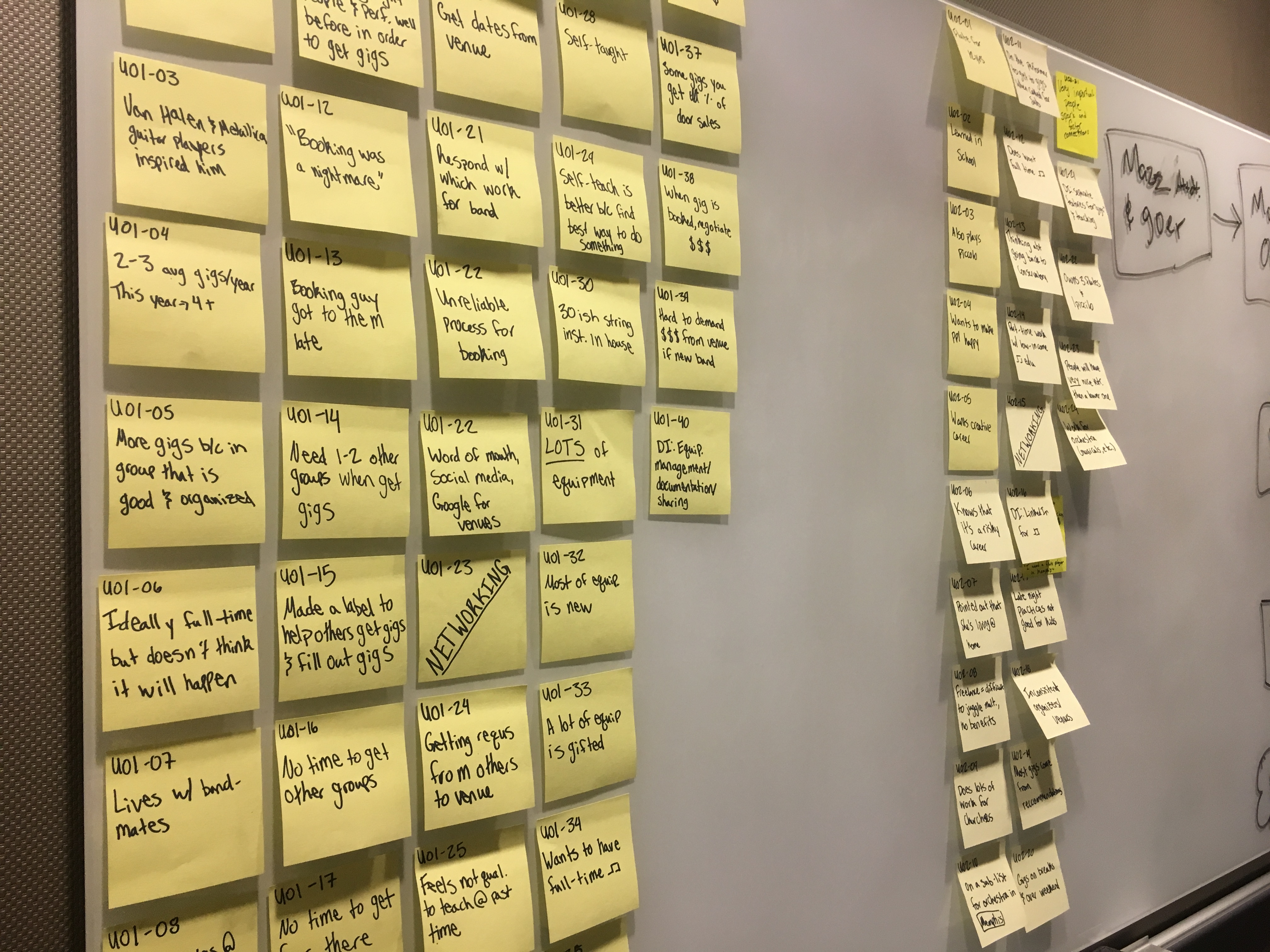
Well organized and documented sticky note analysis of interviews.
Method: Task Analysis
Goals + Justification: Determine the exact pain points in the gig-booking process by mapping step by step the journey of a musician from deciding they want to book a gig to actually playing a live performance.
Synthesis + Findings: We defined a detailed process outline for the act of booking a gig, comprised of 7 high level steps and more than 10 sub-steps to complete the journey. This helped us determine the main interactions musicians experienced that we could target with our design solution to improve the process. This task analysis would later be referenced many times over when justifying design decisions in our low-level prototypes.
Contribution: Mostly a team activity of reviewing the interviews, but my attention to detail definitely made sure none of the finer nuances were skipped in creating a well-organized outline.
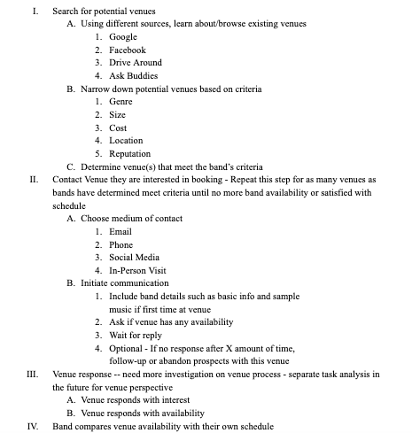
A snippet of the task analysis we created.
Method: Competitive Analysis
Goals + Justification: Explore and gain an understanding of what tools and services already exist to aid musicians and venues with the process of finding and booking gigs. Analyze these tools for their adoption rates and effectiveness and determine if the problem we had uncovered was already being addressed or was still unsolved.
Synthesis + Findings: We discovered 8+ web and mobile applications that vaguely overlapped with the problem space we identified, however they all suffered from serious design flaws and very low adoption rates. There was no dominant solution and as would be confirmed in our survey, musicians did not seem to know or use these apps. The conclusion we reached was that these solutions were all missing a good understanding of the actual user needs and were simply seeking to capitalize on the market gap, however no solution actually filled that gap and it was wide open for us to approach and solve.
Contribution: Mostly a team activity. We all found various resources in our individual research and worked together to analyze their strengths and weaknesses. I did find my ability to verbalize and communicate abstract concepts in an easy to digest manner way was very useful in this analysis process.
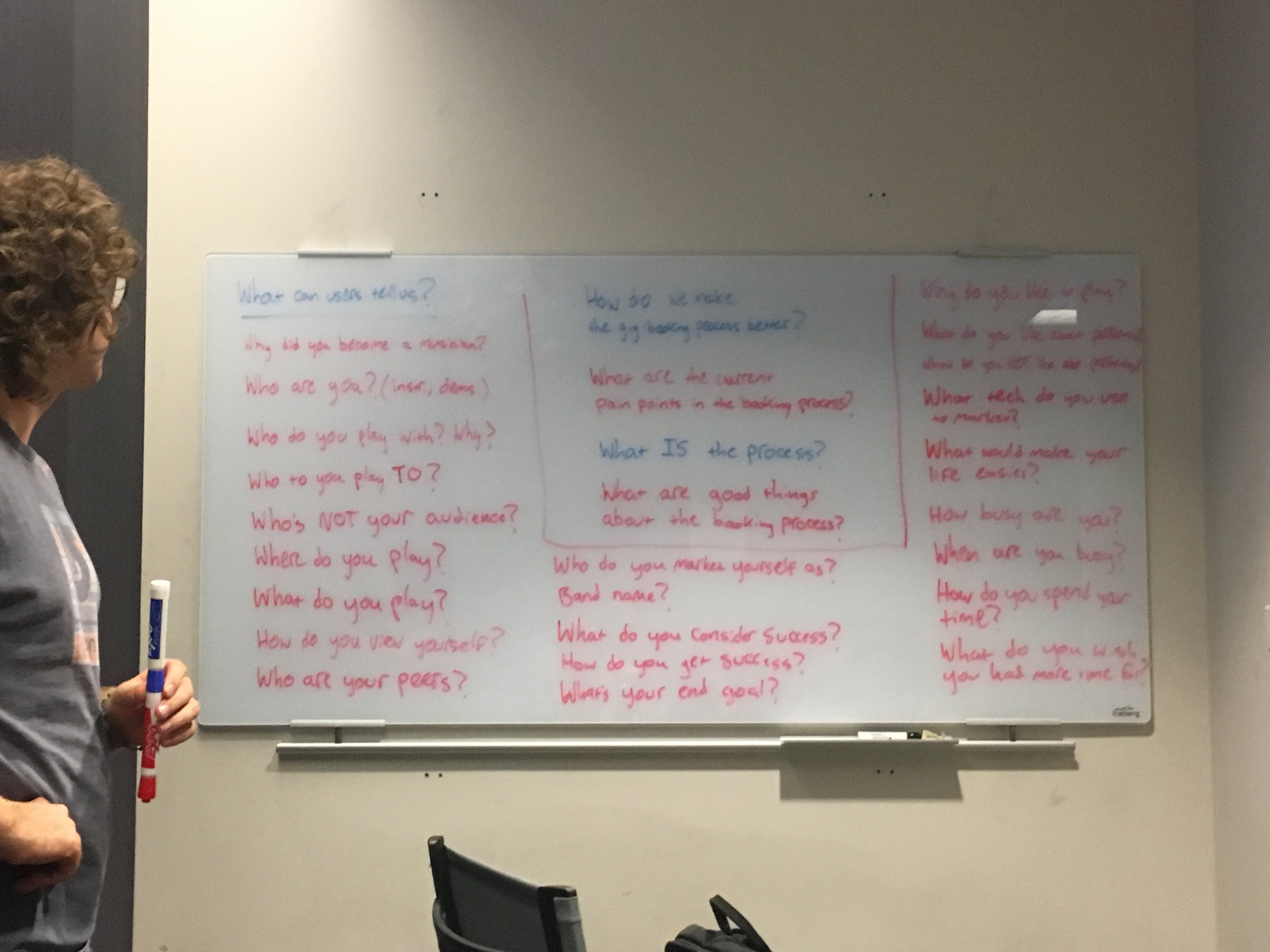
Method: Widespread Survey
Goals + Justification: Gather quantitative data about amateur musicians on a larger scale to help understand broader user behavior patterns and to inform conclusions that would help guide design choices. We carefully crafted each question of the survey with specific research goals in mind and spent many hours fine tuning wording to avoid ambiguity and minimize survey length while maximizing knowledge value.
Synthesis + Findings: By reaching out to friends, family, and social networks we dispersed our survey and received over 50 responses from amateur musicians around the country and even from across the globe. The responses covered a large variety of demographics and provided excellent (although technically not statistically significant) insight into the gig booking experience. The survey consisted of a variety of ranking, multiple choice, multi-select, and other question formats that allowed us to filter results by answers to earlier questions in order to compare and visualize overlapping patterns and trends.
Contribution: Creating the survey was absolutely a team activity. Every member contributed a lot to the survey design from wording and question design to question order and elimination. I would say we definitely relied heavily on the expertise of our team member with a psychology background when trying to create unbiased questions. Sometimes it’s important to know when someone else’s skills have the most to contribute in a certain activity.
Designing the survey questions.
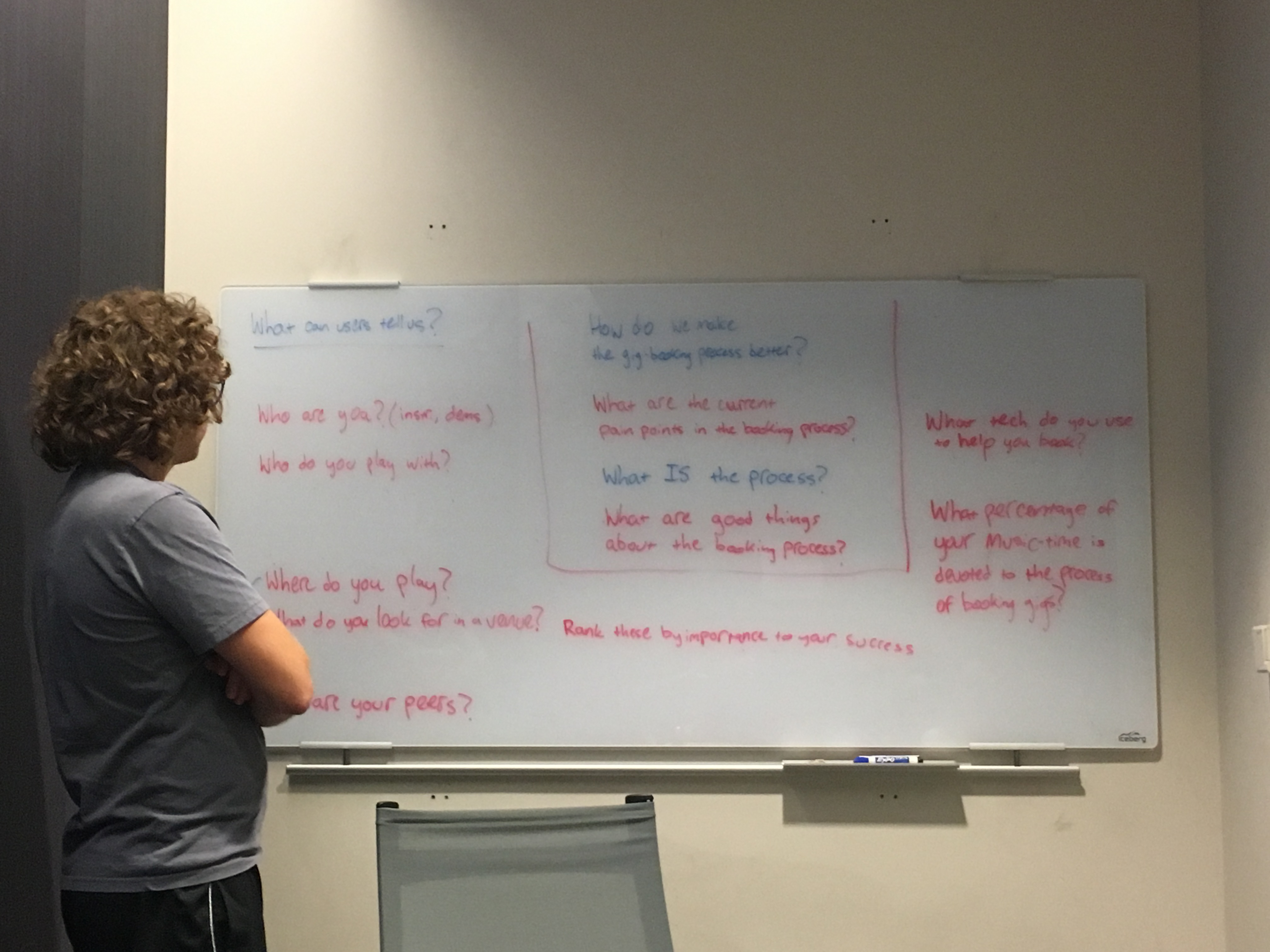
By combining questions and refining wording we worked to consolidate the survey into a much shorter format that people would be more likely to complete.
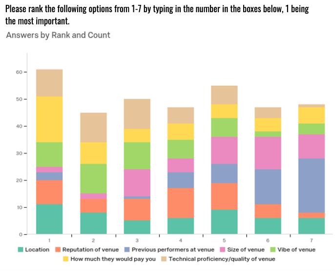
Results from one of the survey ranking questions.
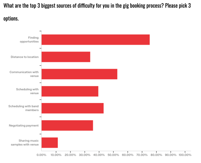
Results from one of the survey multi-select questions.
Method: 5-Minute Sketch Brainstorm (Duct Tape Brainstorm)
Goals + Justification: Work in 5-minute sketching bursts to create as many high-level divergent ideas to address any of the researched pain points within the problem space of the gig-booking process. Then discuss our ideas and narrow down to 3 distinct divergent solutions that address the user needs.
Synthesis + Findings: We created over 10 separate solutions to address the problem space (some ideas more abstract than others). For each solution we developed low-fidelity sketches to explain the basic idea around the concept. As a team we narrowed our ideas down to three distinctly different solutions that struck the best balance between technical feasibility, addressing the problem, and novelty. There solutions were each given a working name to identify them in the next steps: ‘Bookr’, ‘GigExplorer’, and ‘TourBuilder’.
Contribution: I was responsible for at least 4 of the concept sketches as well as playing a key part in organizing the synthesis and paring down of the concepts. Also, I brought the duct tape.
Sketch I made of one possible screen in the GigExplorer solution.
More detailed sketch I did of another GigExplorer screen, this one includes many feature callouts.
Sketch of a screen that would later be mixed into both the TourBuilder and GigExplorer solutions.
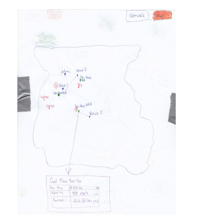
Sketch of the general Bookr app flow.
The legendary duct tape postings in action: organizing, comparing, and combining the ideas as we surrounded ourselves with the sketches.
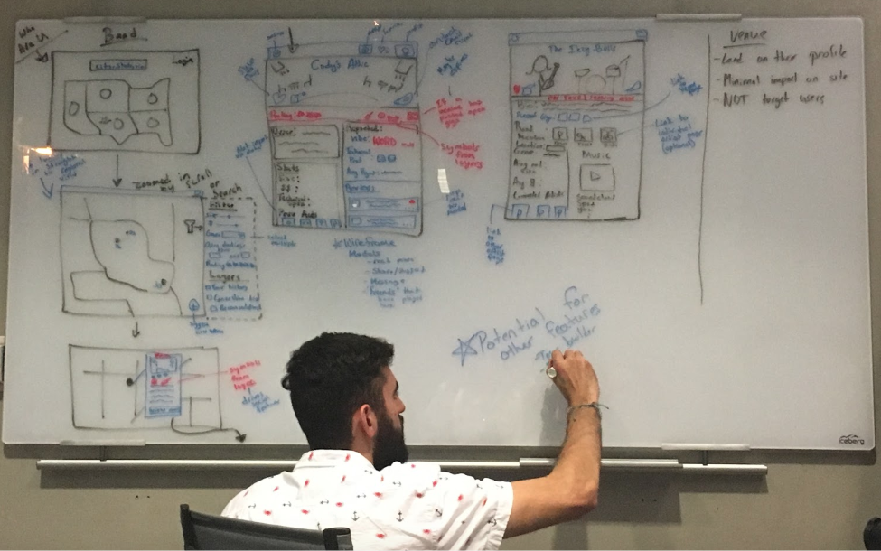
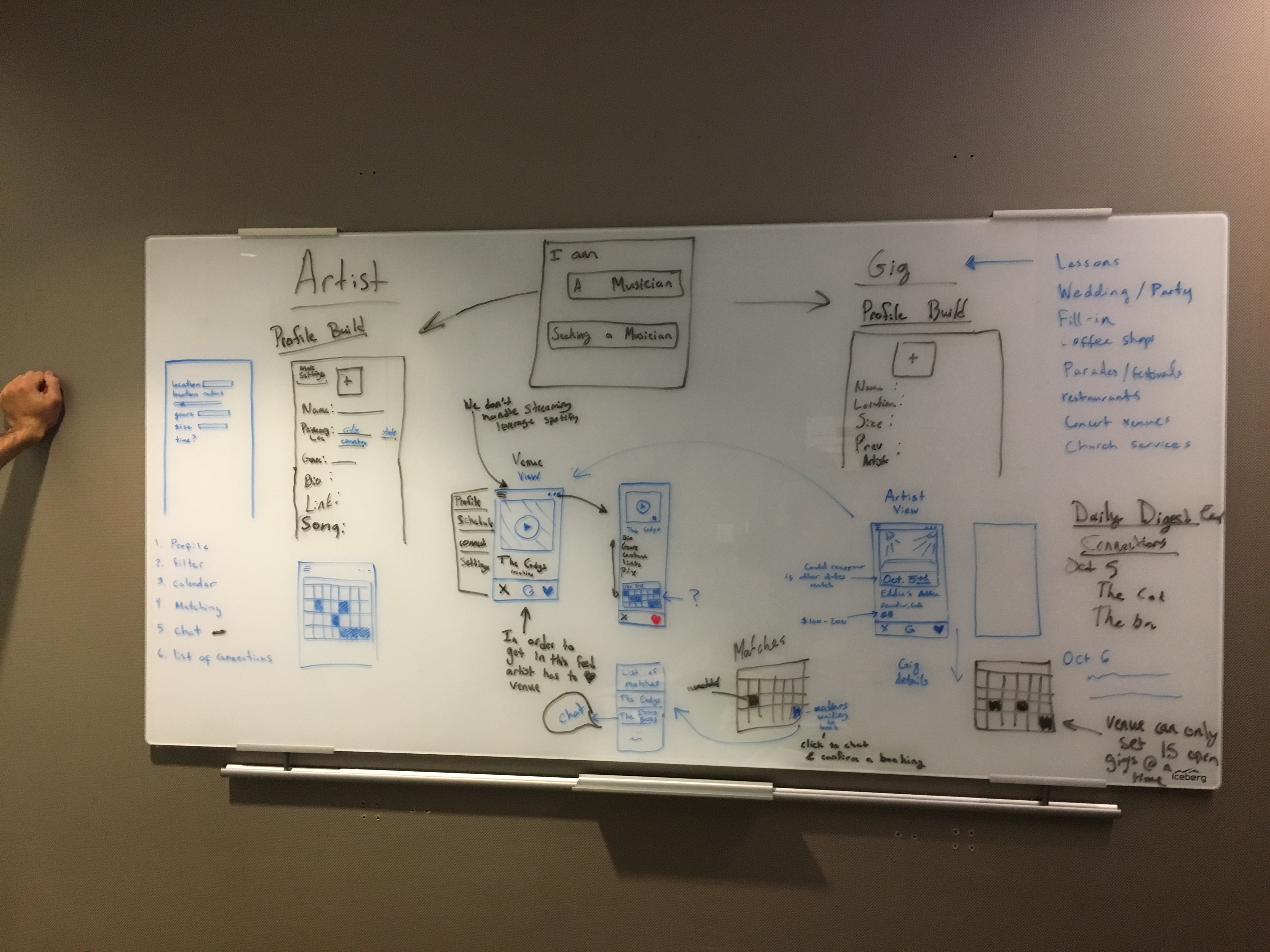
Method: Whiteboarding Key Functions and User Flow
Goals + Justification: Architect and fully map out features, user flows, and key functions/interactions for each of the 3 solutions in enough detail that the team could break apart and work on creating low-fidelity wireframes for each.
Synthesis + Findings: We spent over 8 hours working through the different ideas and crafting their layouts and interactions. The results were basic screen outlines and interaction flows mapping all essential functions of the divergent solutions.
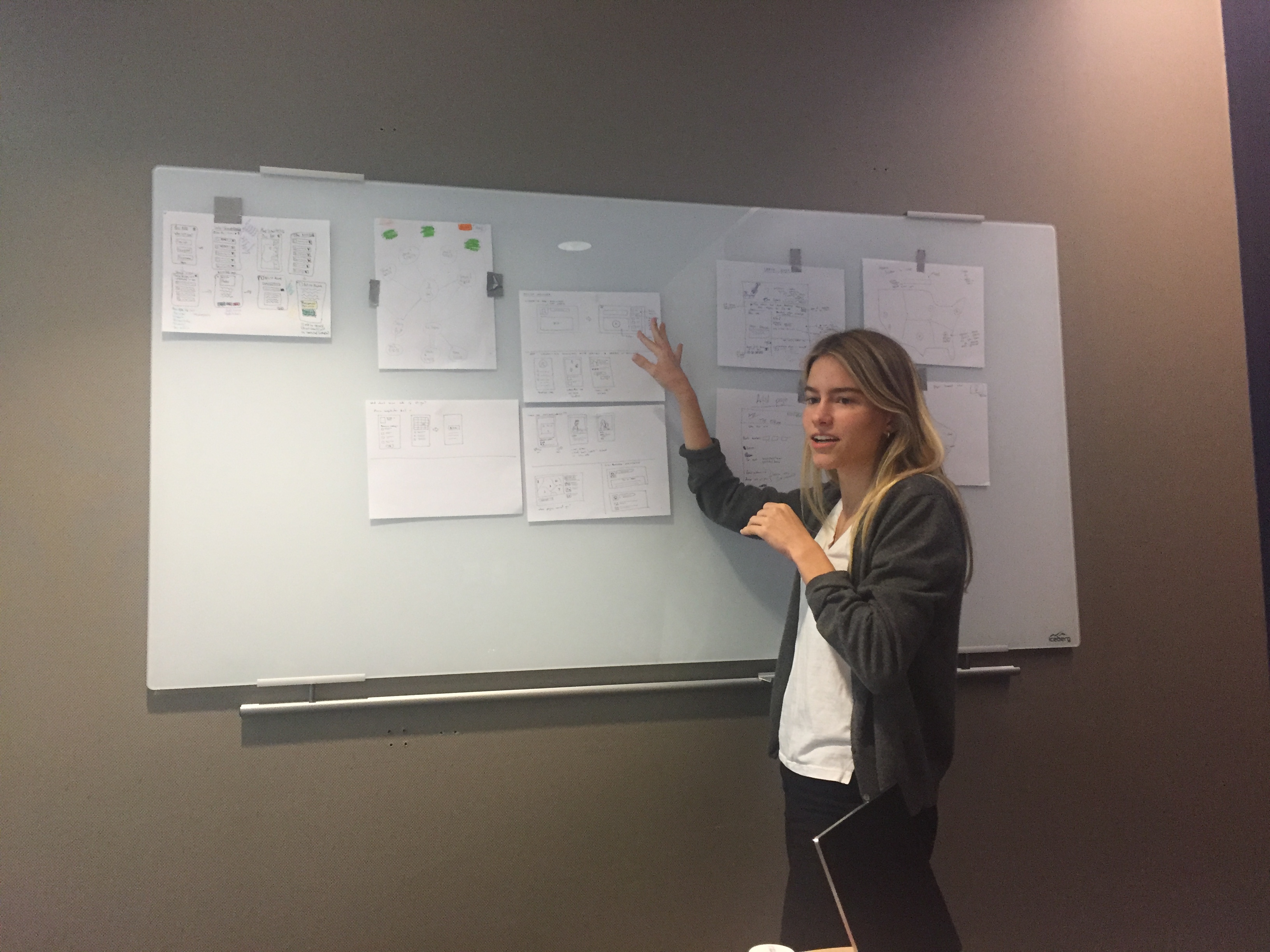
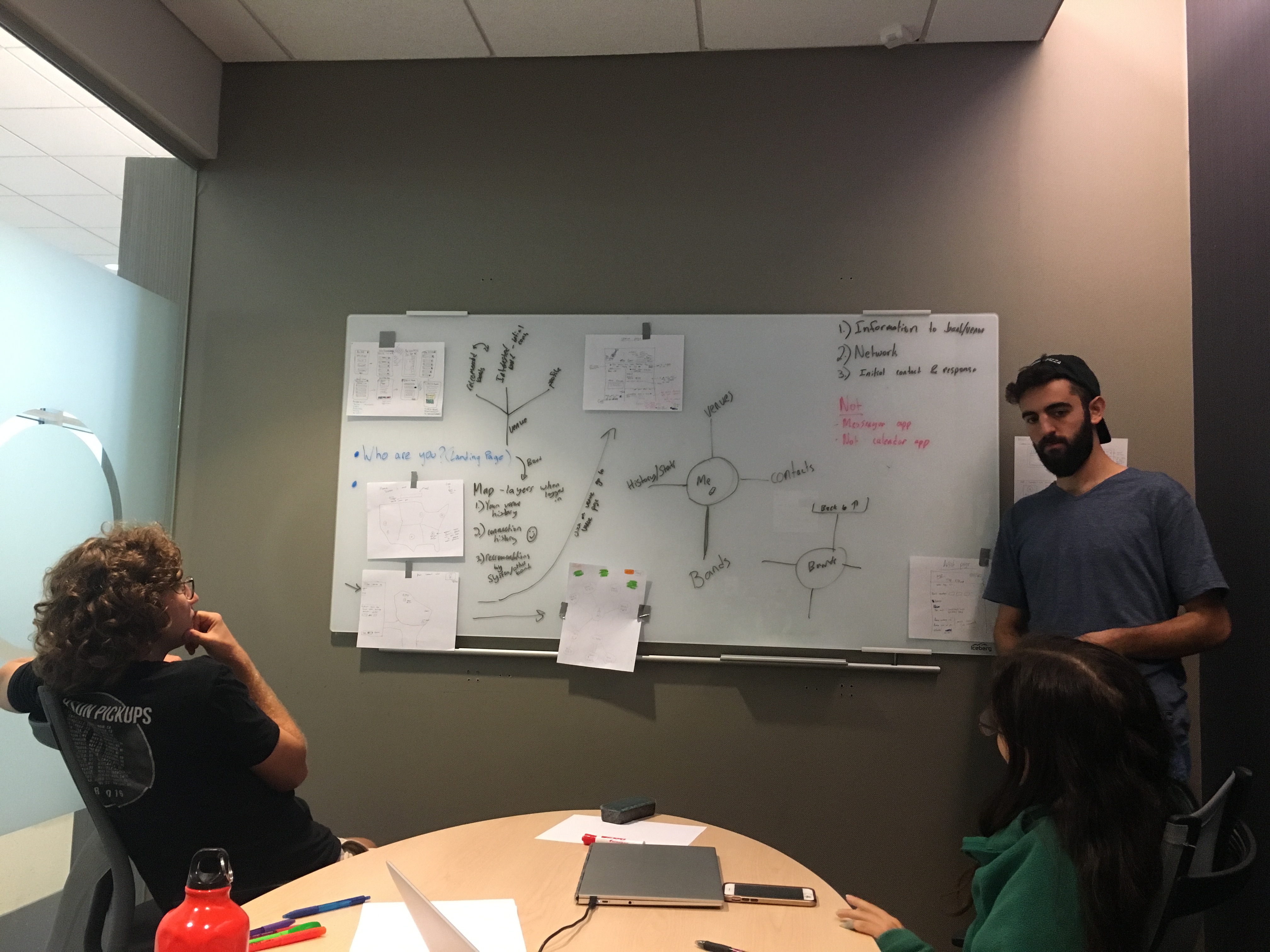
Contribution:I really want to highlight the role I played in this step, pretty much every whiteboard drawing was done by my hand. I guided the group discussion and really dug deep to make sure we picked apart all the essential nuances of each idea to bring them from basic concepts to fully fledged designs. This took multiple iterations on each design and a lot of thinking and rethinking, but the UX architecture we created here laid a strong foundation for the rest of the project.
First round of whiteboarding on the GigExplorer solution, this turned out to be a bit too conceptual so we came back to it and redesigned it more concretely.
Second whiteboarding session on the GigExplorer solution, this time much more oriented on functional screens and flows.
Whiteboarding the flow for Bookr. Yep, that's my arm off to the side there.
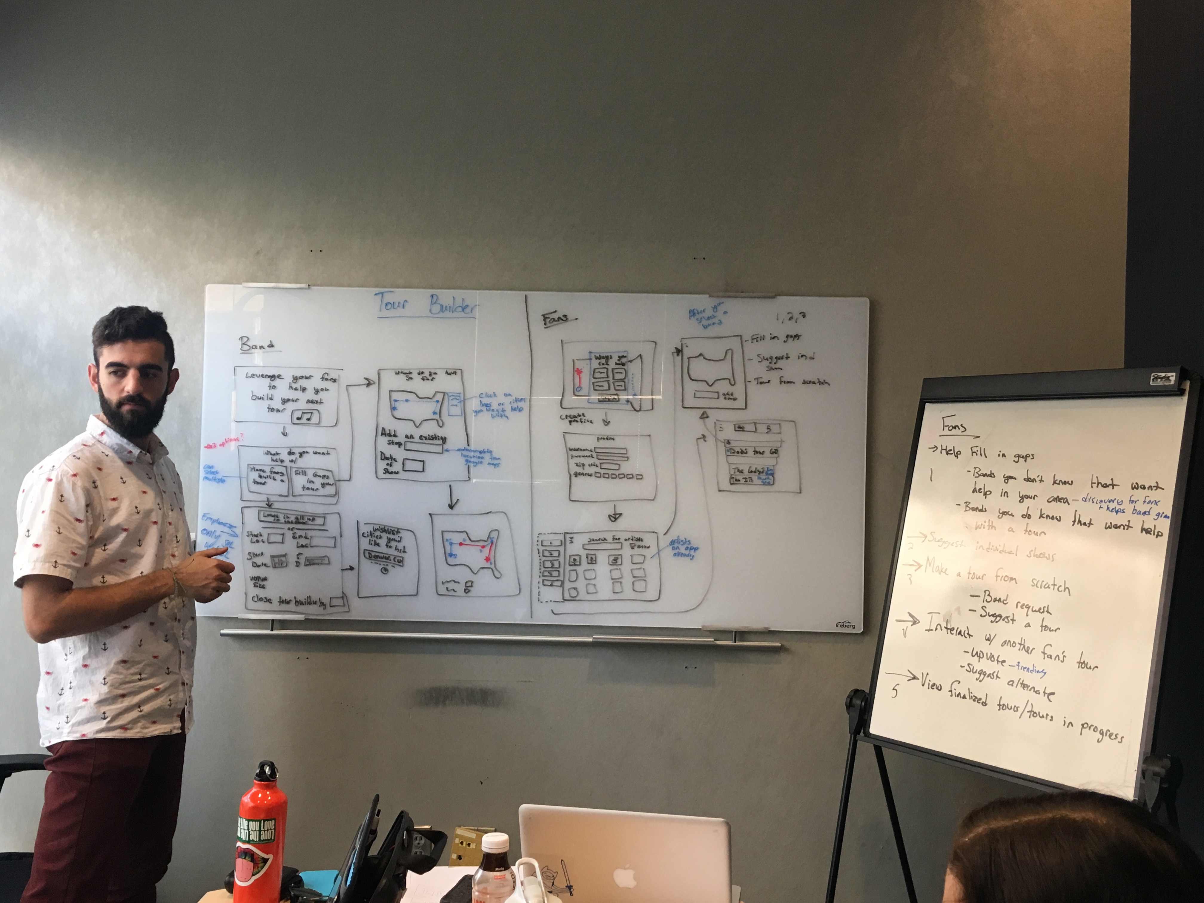
Whiteboarding for the TourBuilder solution, we had to pull in an auxillary whiteboard to get everything up there.
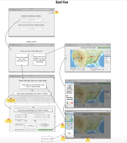
Method: Low-Fidelity Wireframes
Goals + Justification: Transform the whiteboard outlines into low-fidelity digital wireframes that could be presented to users for concept feedback while also avoiding users getting caught in the details of visual design.
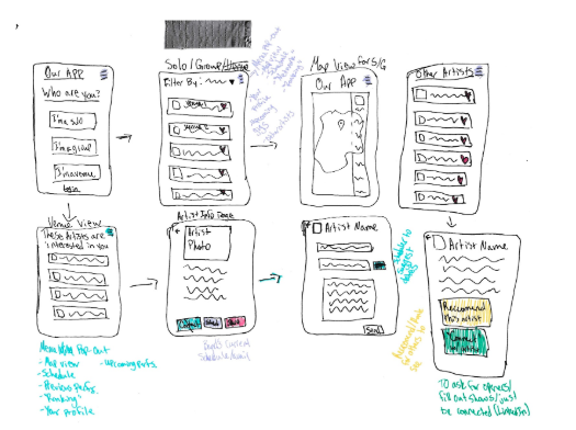
Synthesis + Findings: We used the mockup tool Balsamiq to create these wireframes, as it provides an intentionally sketchy aesthetic that keeps presentation and discussion focused on the concept and flow rather than visual design. The results were three complete sets of wireframes that included the most important screens and interactions from each solution as well as multiple views if user interactions varied based on the user’s role (ie. musician vs venue).
Contribution: I was responsible for wireframing the ‘TourBuilder’ solution and created over 14 screens over two user roles, that included menu systems and navigation flows as well as notation on areas that needed further solution definition or consideration.
Wireframes I built for the TourBuilder solution.
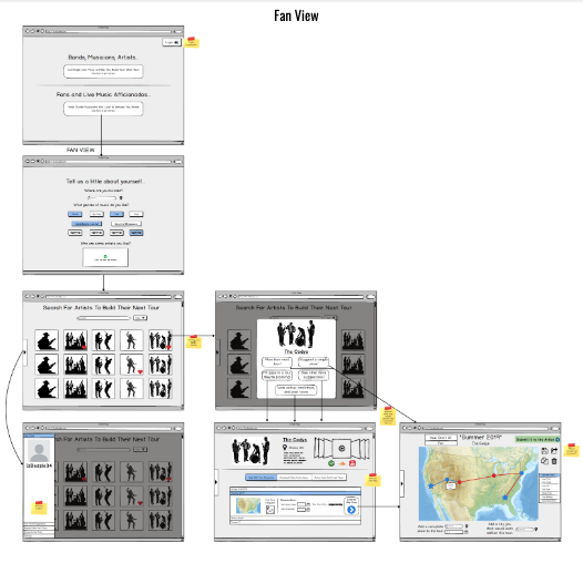
More TourBuilder wireframes I created.
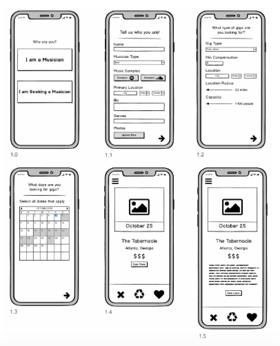
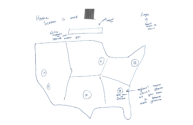
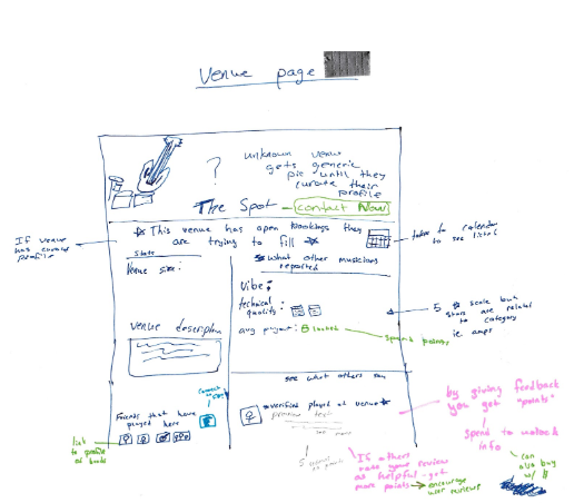
Some of the wireframes for Bookr.
Wireframes for GigExplorer.
Method: Storyboarding Each Divergent Design
Goals + Justification: Communicate user interactions for each of the three design solutions with a simple storyboard visualization.
Synthesis + Findings: We created storyboards for each of the solutions, 4 in total with the Bookr design requiring two separate boards to visualize the difference in experience between venues and musicians.
Contribution: I created the storyboard for the ‘TourBuilder’ solution due to my intimate familiarity with it from the wireframing phase. I completely acknowledge at that time my artistic skills weren’t as good as the team member with an Industrial Design background, however since this was an academic project at its core, I wanted to use this opportunity to practice those skills and try my hand at this form of visual communication. (Since the time of this project my storyboarding skills have significantly improved through study and practice).
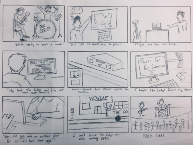
Storyboard I created for the TourBuilder solution.
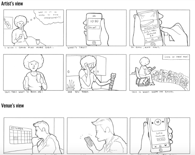
Storyboards a team member created for Bookr.
Method: Outline Design Decisions
Goals + Justification: For each design solution, review the design choices we made and communicate as many possible choices in relation to earlier research findings and previously notated design implications in the project, while also taking count of the strengths and weaknesses of each design solution compared to the others.
Synthesis + Findings: We defined over 25 distinct design decisions across the three solutions that were made based on findings from the interview and survey data from earlier in the project. We thoroughly documented the justifications for each decision for later reference and formal presentation purposes. This process also helped us make sure that the designs we had created were aligned with and directly informed by the research we had done earlier in the project.
Contribution: Due to my close work with the ‘TourBuilder’ solution, I was able to communicate most of the design decisions, strengths, and weaknesses for that concept. By analyzing weaknesses as well as strengths it helped create a realistic detachment from and objective consideration of something that I had spent a lot of time working on, which would be essential when it came time to select a single solution.
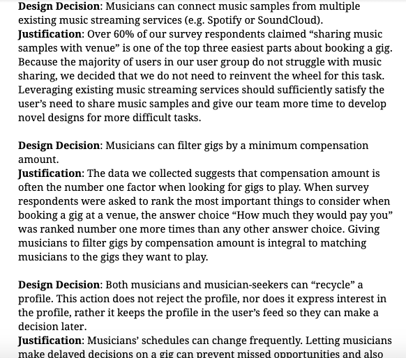
A snippet of our documentation of design decisions and how the relate to our research.
Method: User Concept Feedback
Goals + Justification: Informally present design solutions to the initial interviewees and other relevant parties for outside user perspectives on the value of each design and eventual selection of one design to move forward.
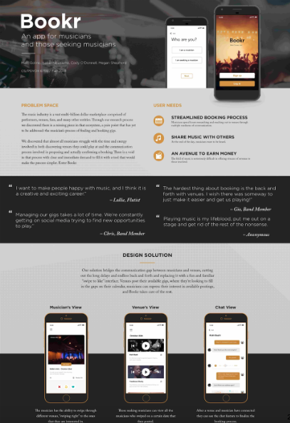
Synthesis + Findings: After presenting the solutions and gathering feedback we determined the design solution that would add the most value to our users and be the most viable for continued development was the ‘Bookr’ mobile application.
Contribution: I contacted my original interviewee as well as one of his musician roommates and gathered feedback on the designs from both of them. This provoked extensive discussions on what was viable…and if development on this project would continue after the semester.
Method: High-Fidelity Mockup
Goals + Justification: Take one of our design solutions that we deem most effective and build it out further into a high-fidelity mockup using Adobe XD for further user testing and concept evaluation.
Synthesis + Findings: We created a high-fidelity mockup of the ‘Bookr’ mobile application, fleshing out gaps in the initial wireframe and defining a visual aesthetic.
Contribution: While all team members had input on the look and feel of the mockup (and while I do have sufficient experience with Adobe XD), the actual creation of the mockups was delegated to the team member with a strong Industrial Design background.
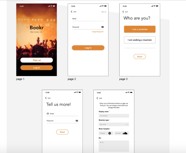
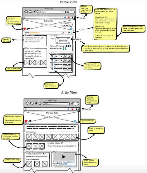
High-fidelity mockups for the Bookr solution, created in AdobeXD.
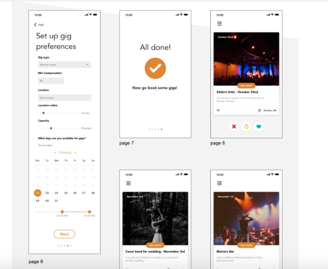
Another group of screens for Bookr.
Method: Clickable Prototype
Goals + Justification: Choose between Adobe XD and InVision Prototyping and enhance the high-fidelity mockups with clickabilty to create an interactive user flow demonstration and enable actual usability testing.
Synthesis + Findings: We chose to simply enhance our existing Adobe XD project by adding clickthrough features to various points in the prototype that would allow a user to navigate through the experience.
Contribution: This was a relatively simple enhancement to our existing mockup and was delegated to another team member.
Method: Poster Presentation + Report Writing
Goals + Justification: Create a visually appealing poster to communicate our existing design solution and present this poster along with the project details to professors and fellow students at a mini design showcase. In addition, document process and progress through the project with a series of detailed written reports.
Synthesis + Findings: We created a poster and successfully presented it along with our clickable prototype at the showcase. Over the course of the project four lengthy (50-80 page) reports were created to document our workflow.
Contribution: While the actual poster design and fabrication was done by another team member, I took the lead in presenting our project to other people at the showcase. One of my strengths is interpersonal verbal communication and sharing our work in this way came naturally, and quickly turned into an almost scripted clean introduction and explanation of our work. As far as the report writing was concerned, I contributed an overwhelming amount of text over the 4 documents, due to my ability to clearly verbalize and communicate most processes and concepts in a clear, but detail focused manner.
The poster that we created and printed out to use as visual guide for presenting at the showcase.
Method: Create Evaluation Plan
Goals + Justification: Develop a comprehensive plan for user and expert testing of our prototype that could be used to gather statistically significant data for future iterations.
Synthesis + Findings: We created a list of over 25 key usability specifications that we could quantitatively measure through user testing. In addition, we outlined a moderated user-testing plan that involved users taking on different roles and executing 3 distinct scenarios, each tied to a number of the usability specifications. We also created a short qualitative survey to distribute to users post testing along with a list of verbal questions that we could directly ask them about their experience. Finally, we defined broader testing plans to be used with heuristic experts and evaluations we could perform after a hypothetical product launch and deployment.
Contribution: I contributed heavily to the qualitative side of the evaluation plan, both in the creation of the post testing survey and verbal questions. I also worked specifically on identifying what key aspects of our design needed testing and in what way that testing would help inform future decisions and iterations.
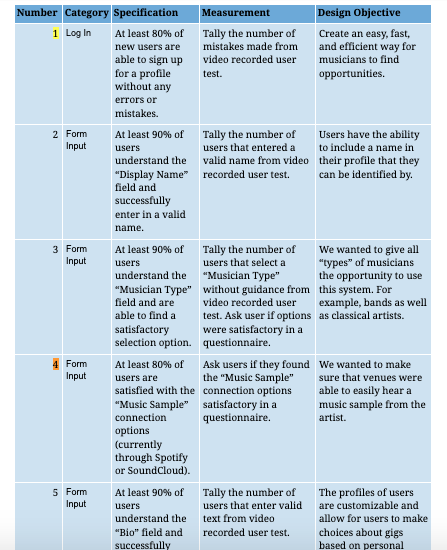
A snippet of the usability specifications we created for our evalutation plan.
Method: User Testing – Quantitative + Qualitative
Goals + Justification: Execute a slimmed down version of the evaluation plan outlined above with fellow students and any available users in order to identify pain points in the design for future iterations.
Synthesis + Findings: We performed user testing with 5 participants from backgrounds of various relation to our subject matter. Each user executed tasks in two separate scenarios, and then completed a short questionnaire. While the participants were completing each of the tasks, the screen of the prototype was recorded along with the corresponding audio acquired by instructing users to think aloud as they moved through the application. We used their verbal thoughts to assist our objective evaluations and provide additional qualitative feedback not specifically measured by the quantitative specifications.
Contribution:I executed one of the user tests and gathered evaluation data as an observer and administrator. The user test I performed ended up producing the lengthiest recorded session of all of the subjects, due in part to my probing questions into the user’s actions and thought process as they completed the tasks. This probing often yielded very valuable insights that would have been otherwise overlooked.
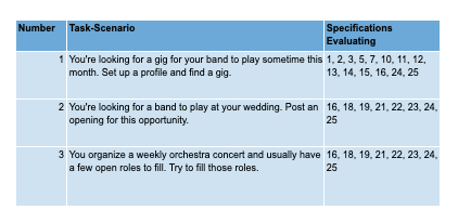
A look at the usability testing scenarios we created and how they related to the criteria we had defined.
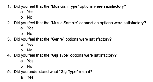
Some of the questions presented to testers after completing the scenario. These questions were loaded into and administered through the Qualtrics survey tool.
Method: User Testing Video Review
Goals + Justification: Gather as a team and review all user testing sessions in order to share knowledge of the test results and synthesize the findings into a concrete plan for a future iteration.
Synthesis + Findings: We gathered 5 pages of comprehensive notes from the evaluations, including many valuable direct quotes from testers. We compared and contrasted this qualitative information with the quantitative results of the questionnaire and created a plan for future project development and iteration.
Contribution: Although we listened to the recorded tests together as a team, I have a good ear for picking out important insights when users give feedback and often times would pause or rewind the recording to make note of an almost overlooked but essential detail from the test.
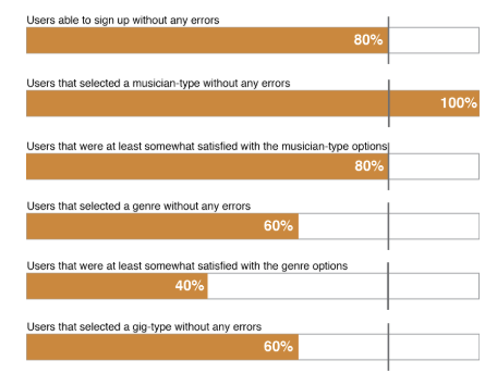
Quantitative results from the usability testing.
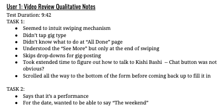
Qualitative notes from the video review session.
Conclusion
Although there was no opportunity to further iterate on the design before the semester drew to a close, my team and I consider this project an overwhelming success. We followed every step of the design process, and not just because we had to, but because as the project progressed, each step forward was the logical and natural continuation of the prior. We all came away having gained many new skills and a great understanding of how to truly implement effective design and how to use the best tools and techniques to do so.
In addition, our team goal at the start of the project was to create something that could potentially last beyond the end of the class. We submitted our project to the Georgia Tech Create-X startup incubator and made it through two rounds of discussion and interviews. And if that wasn’t enough, the two musicians who I interviewed throughout the process had recently started their own record label and are currently interested in taking our design work forward into an implemented solution.