Overview
Bookr was a semester-long HCI design project focused on a specific opportunity: helping amateur musicians find and book gigs more effectively. Through research with musicians, our team identified gig booking as a persistent pain point and developed a mobile concept aimed at connecting musicians with venues more directly.
The project took place in an HCI Design Foundations course, but its main value came from carrying a full design process from early framing and research through concept development, prototyping, and usability testing. Our work began with a broad problem space and ultimately narrowed to Bookr, a mobile app concept designed to make gig discovery and booking more accessible for amateur musicians.
Through that process, we moved from early framing and research into three divergent concept directions, then narrowed to the final Bookr solution. That direction was eventually refined into a clickable prototype used for usability testing and future iteration planning.
My Contribution
I contributed across the project, with particular ownership in UX architecture and communication-heavy work. That included guiding whiteboard sessions and group discussions, shaping the project structure, contributing heavily to report writing and agenda planning, sharing updates with our professor and TA, and presenting the final poster at an informal design showcase.
Research and Framing
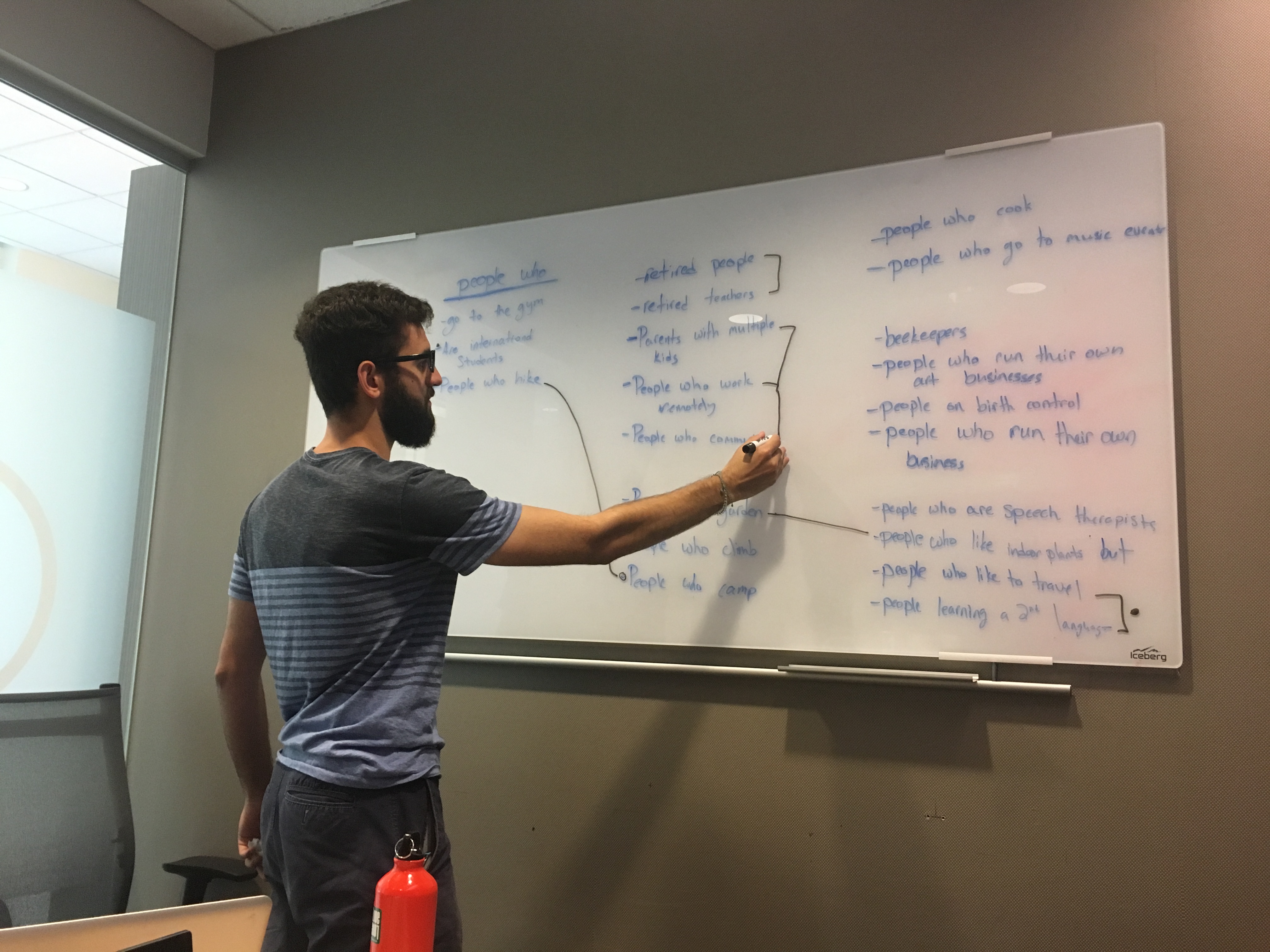
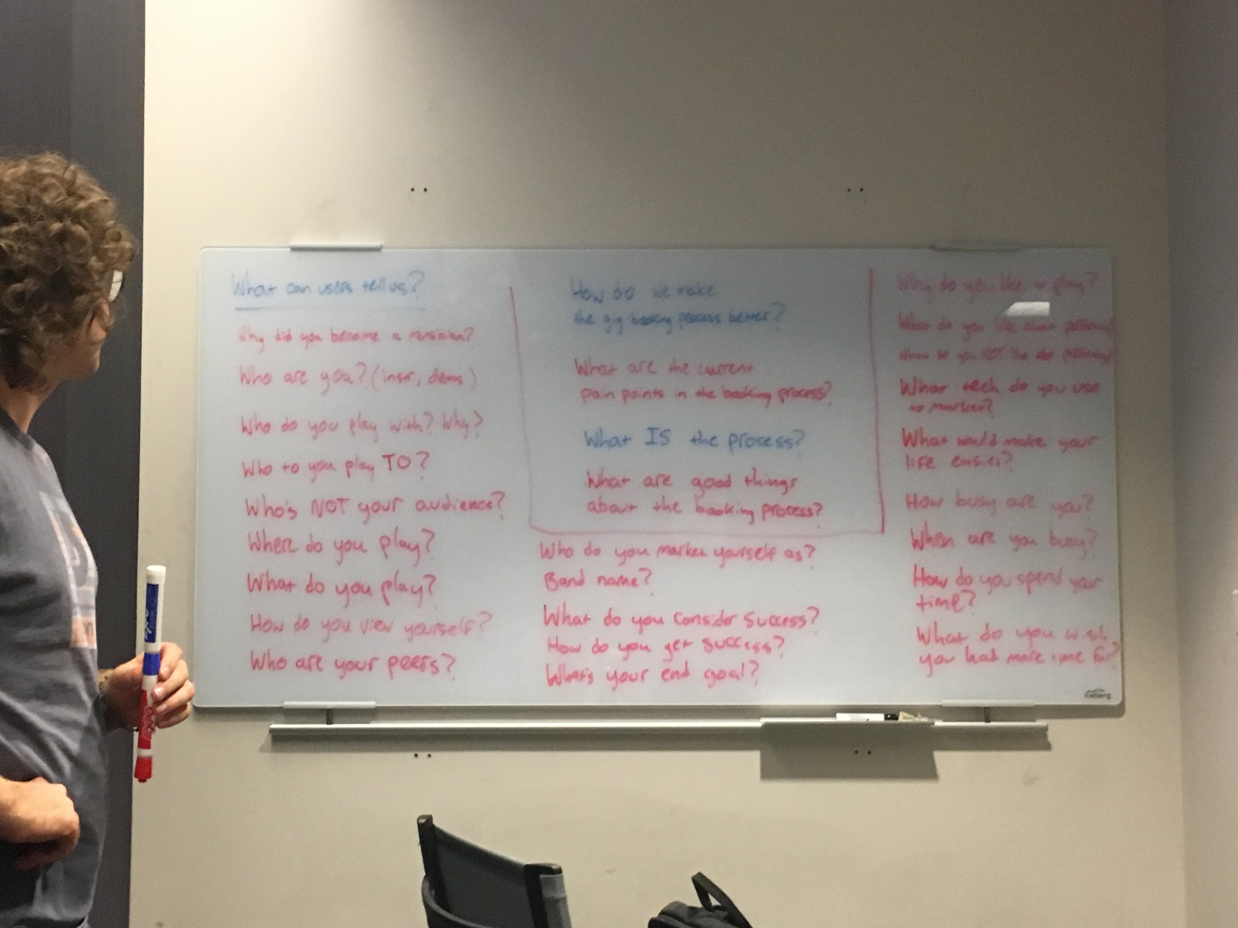
The project began with a broad problem-space brainstorm aimed at identifying an accessible user group with meaningful pain points. Through rapid whiteboard ideation, we generated more than 30 possible directions before narrowing to a single focus: amateur musicians who want to leverage their skills to earn money.
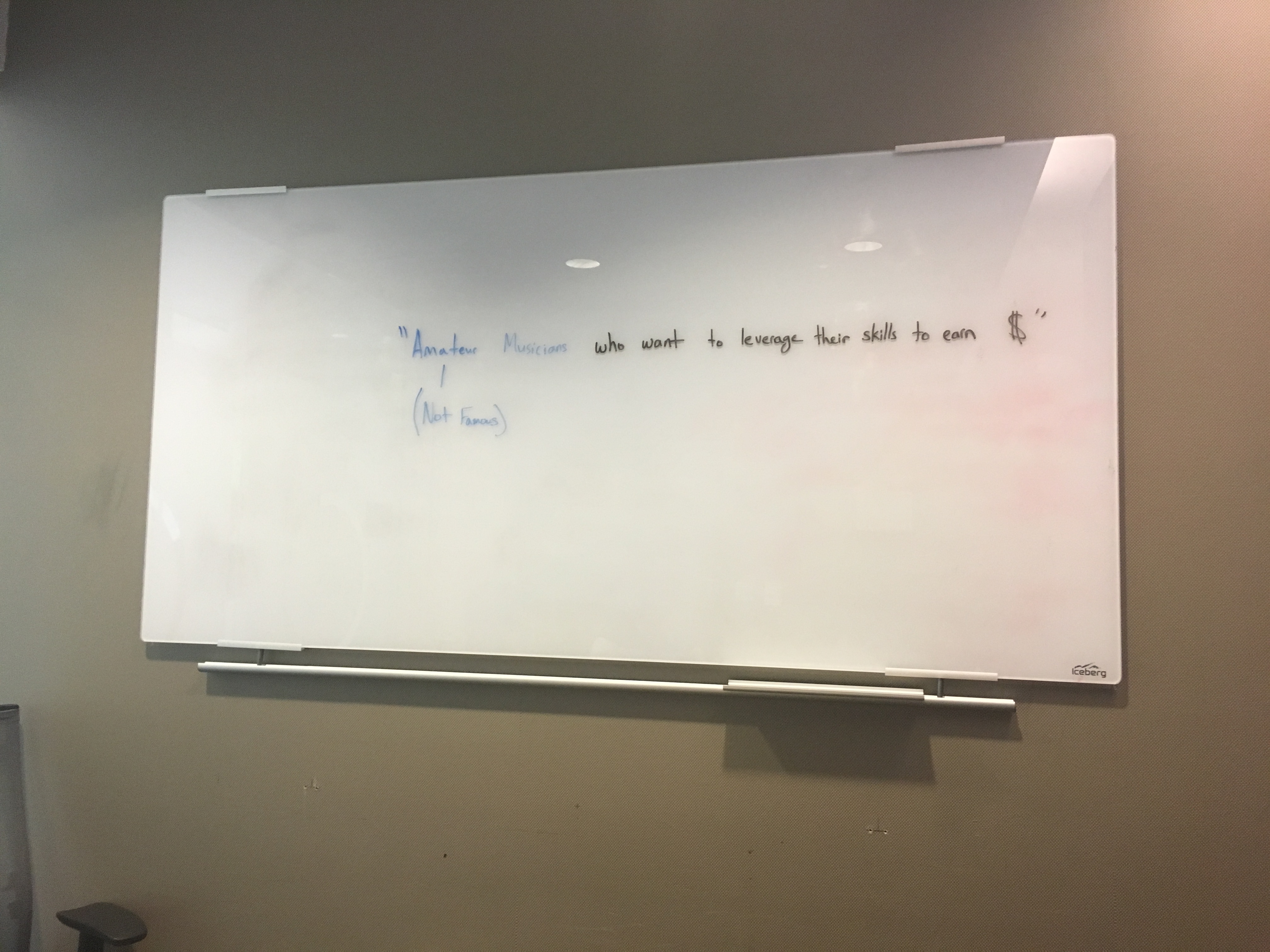
The project began by turning a broad space of possible users and needs into a clearer problem definition we could actually research
Once we had that direction, we defined user attributes and design implications to better understand the physical, social, cognitive, and perceptual realities amateur musicians might bring to any product we designed.
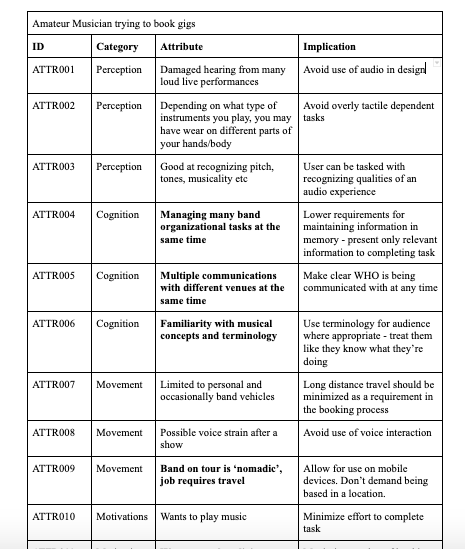
User attributes helped us connect musician realities to more concrete design implications from the start
We then moved into primary research. Semi-structured interviews with musicians gave us a much clearer understanding of the overall process of being a performing musician, the tools and mental models they used, and the friction points that shaped their work. Most importantly, those interviews surfaced a recurring pain point around finding and booking gigs.
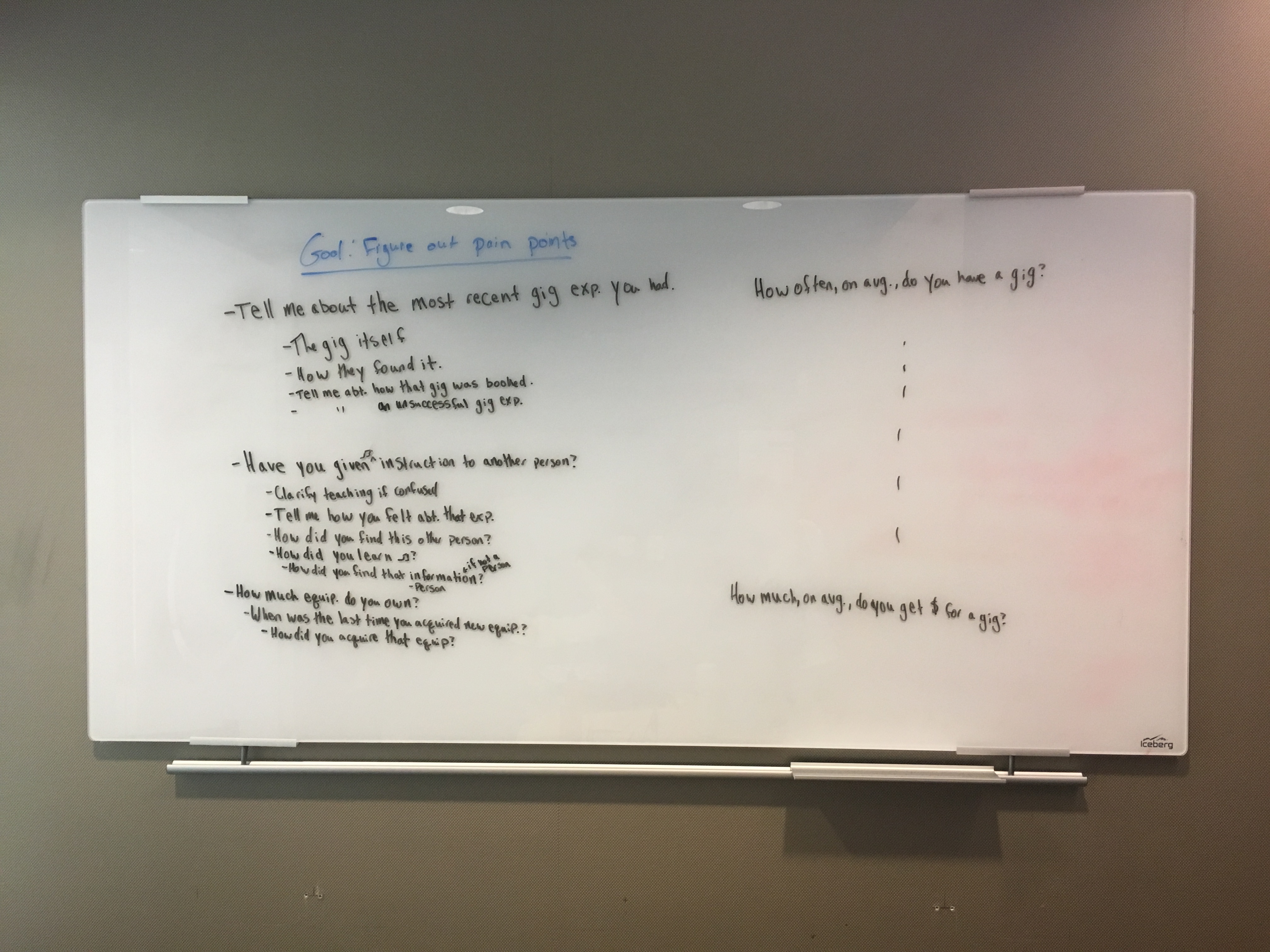
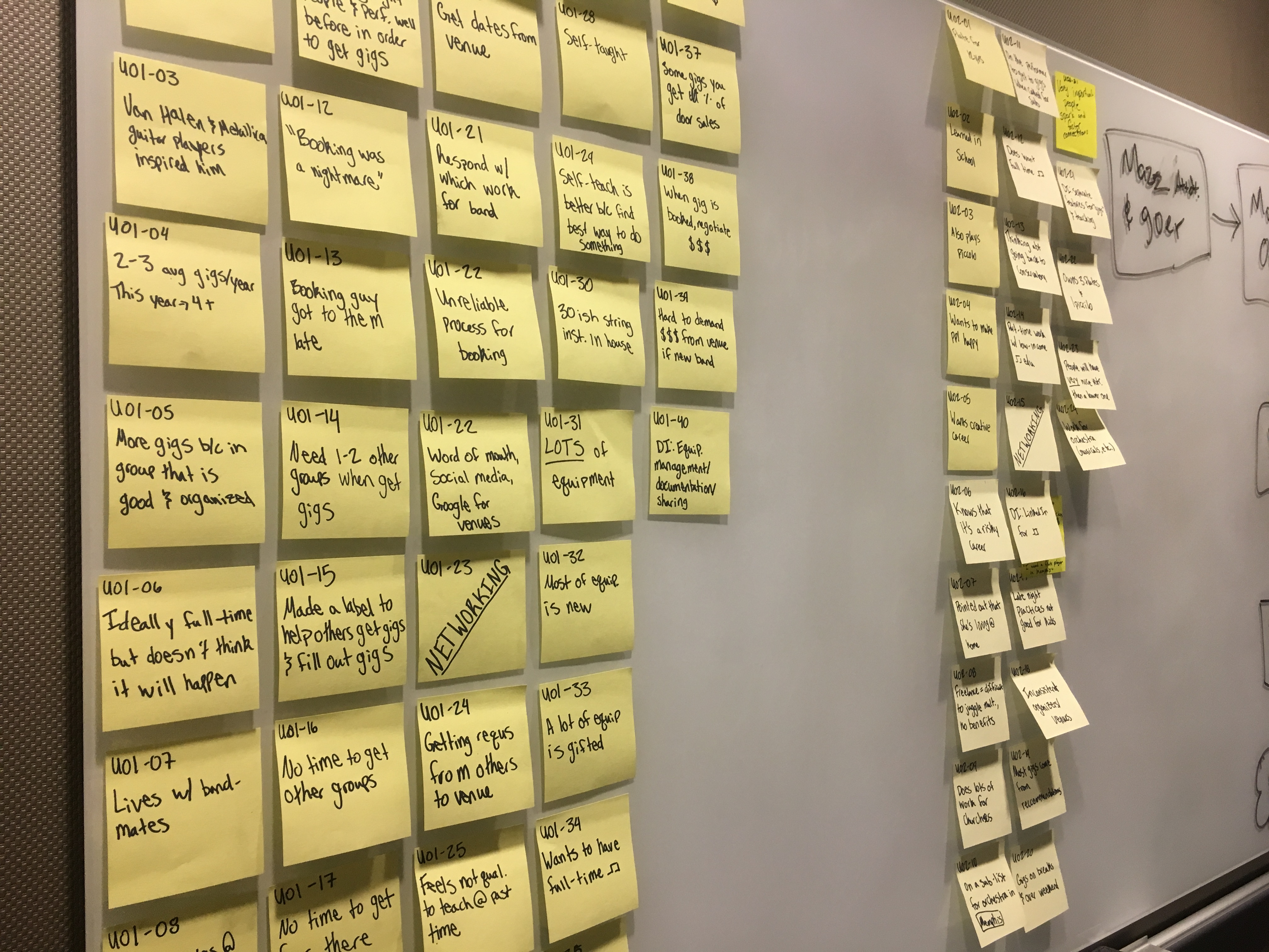
Interviews helped us move from a broad interest in amateur musicians to a sharper understanding of the gig-booking problem
We complemented those interviews with task analysis, competitive analysis, and a wider survey. Together, these methods helped us map the gig-booking process step by step, assess what tools already existed, and gather broader directional signals from musicians beyond our interview set.
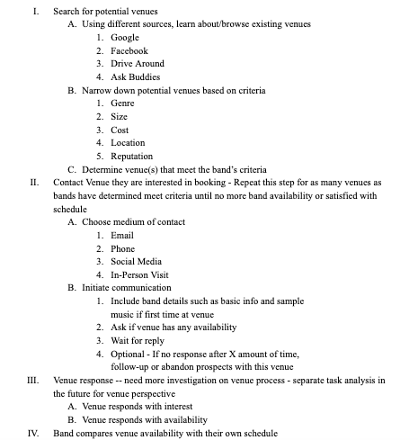
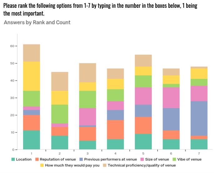
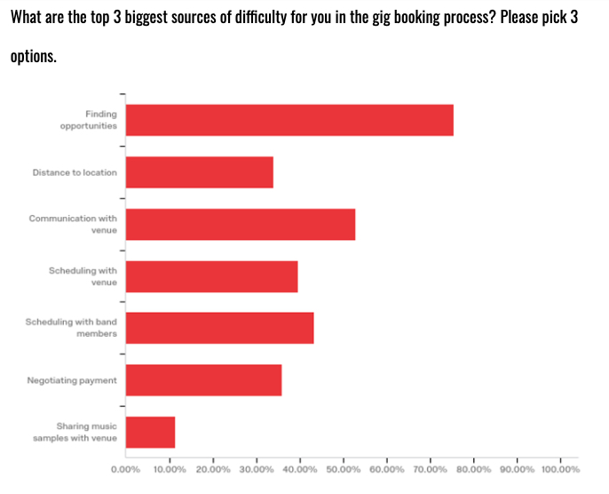
Task analysis, survey design, and broader quantitative responses helped us validate that the booking problem was real and still underserved
Divergent Concepts
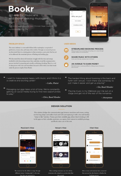
After grounding ourselves in the problem space, we moved into divergent ideation. Working in rapid five-minute sketching bursts, we generated more than ten possible concepts that addressed different parts of the gig-booking experience. We eventually narrowed those ideas down to three distinct directions: Bookr, GigExplorer, and TourBuilder. These three directions represented meaningfully different ways of addressing the same problem: discovering gig opportunities, planning tours, or directly connecting musicians with venues.
Rapid concept sketching helped us explore multiple solution directions before committing too early to one path
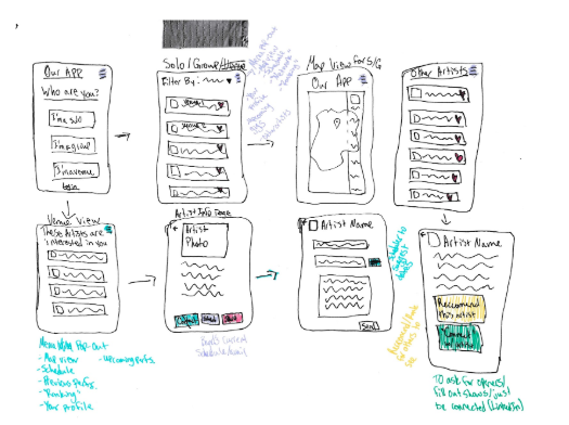
We then used long whiteboarding sessions to turn those early concepts into more complete flows, screen structures, and interaction models. This phase was especially important for me because I played a major role in driving the UX architecture discussions and translating abstract ideas into more concrete system behavior.
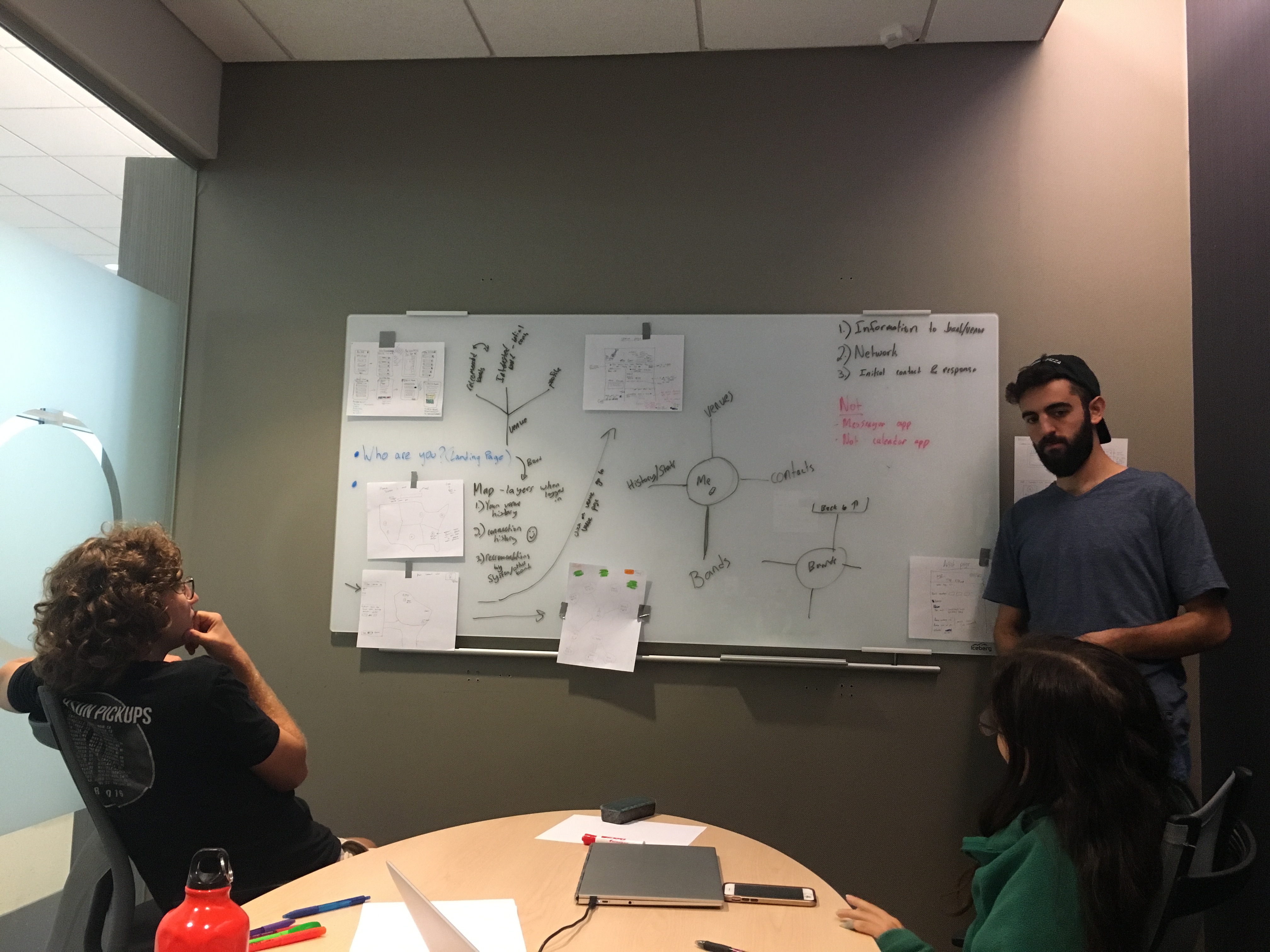
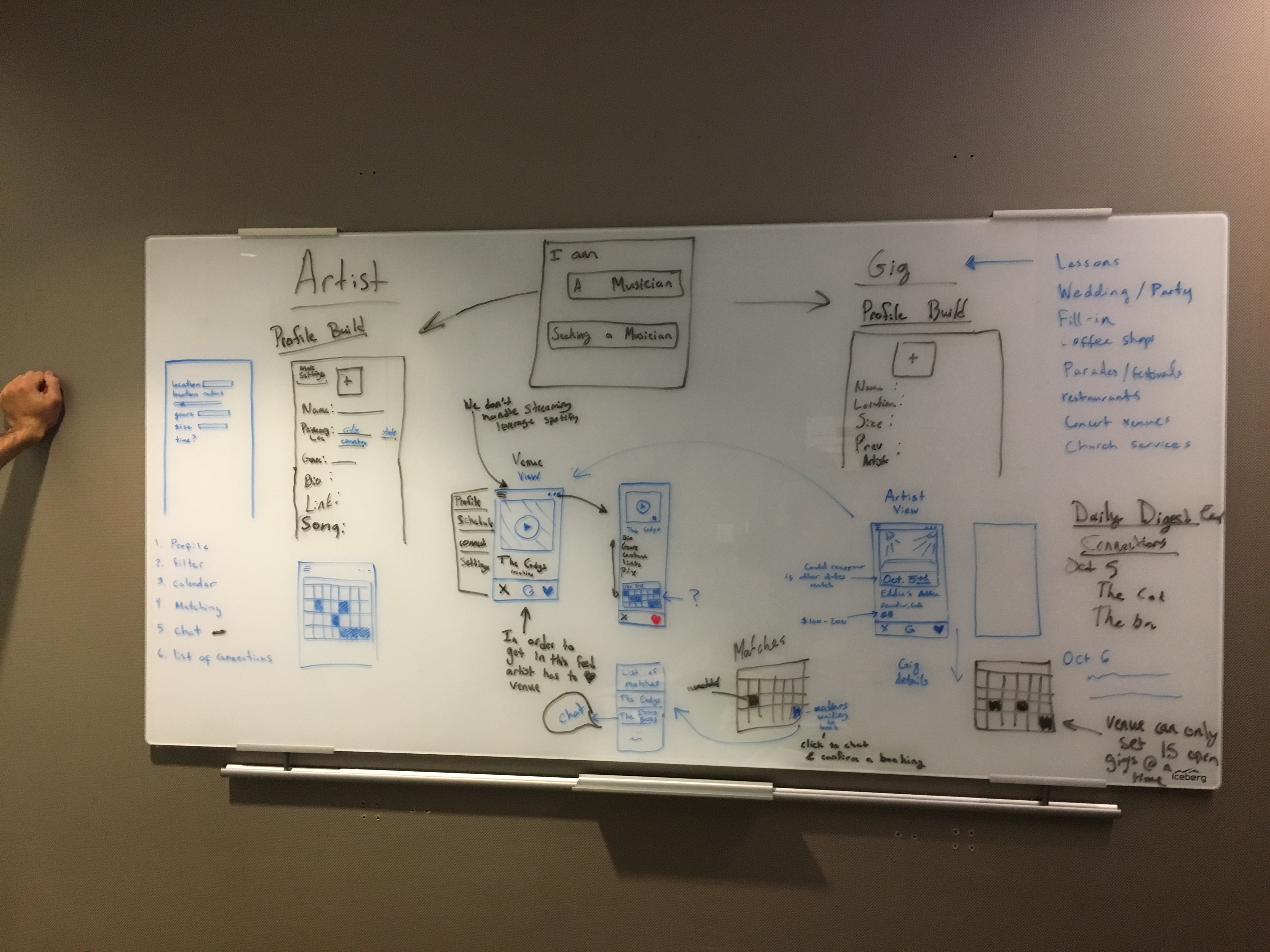
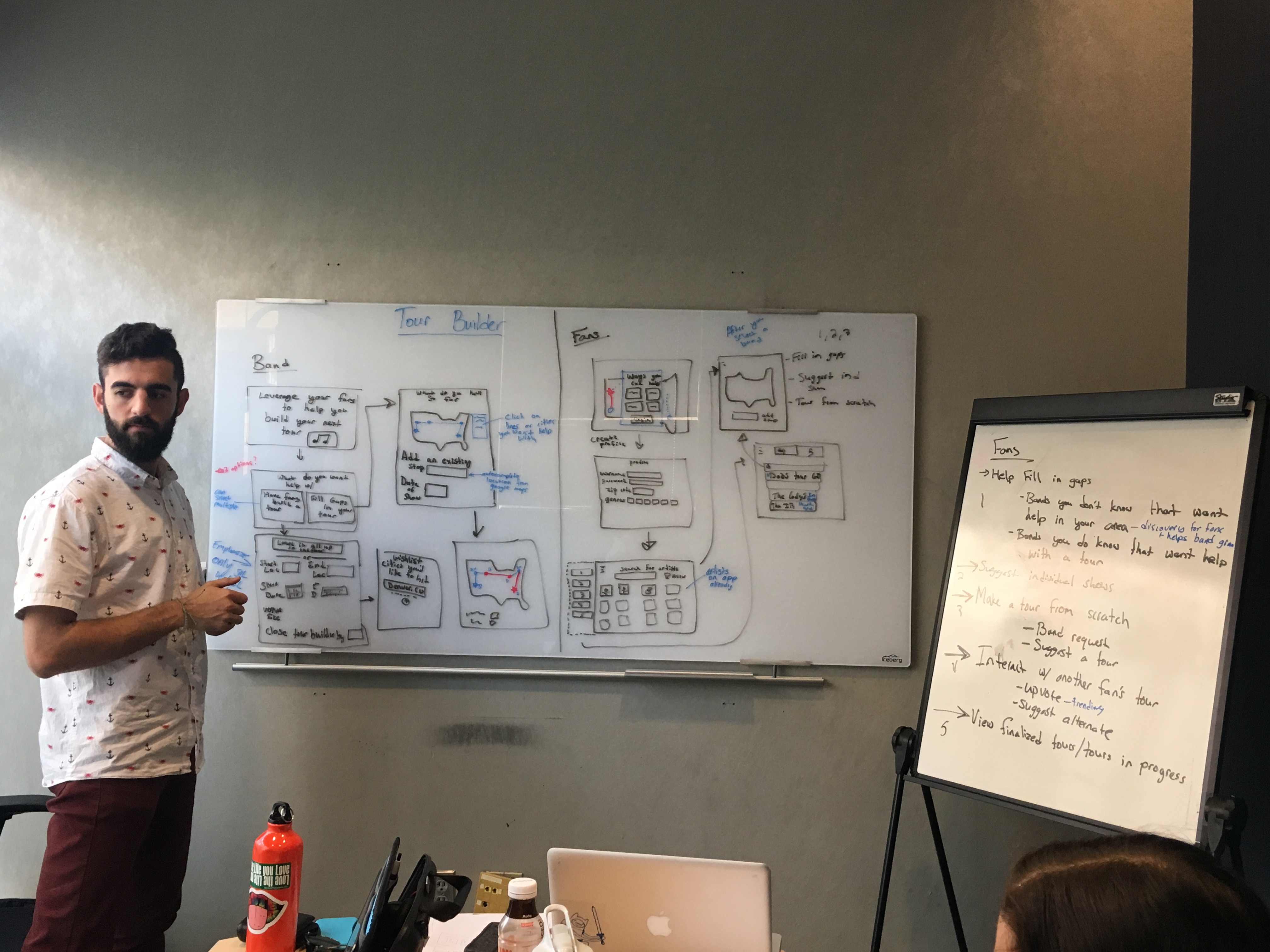
Whiteboarding helped us evolve the concepts into more specific user flows, screen logic, and interaction structures
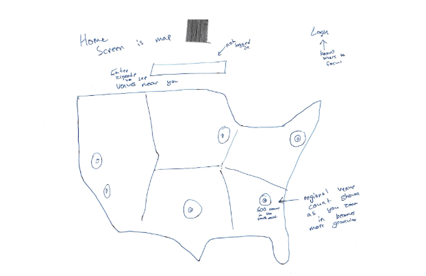
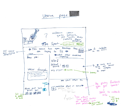
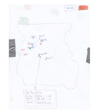
From there, we created low-fidelity wireframes and storyboards for the divergent concepts so we could compare them more concretely and gather feedback on which direction had the most value and viability.
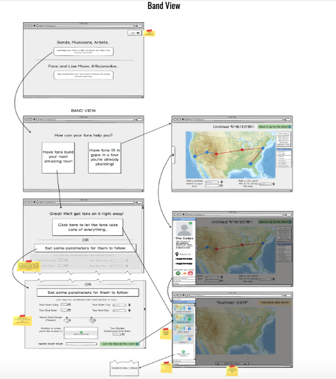
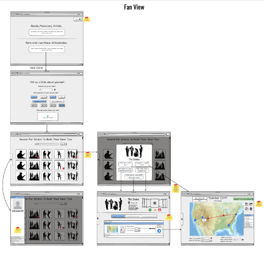
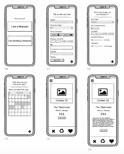
Low-fidelity wireframes gave us a way to compare the concepts based on structure and flow rather than visual polish
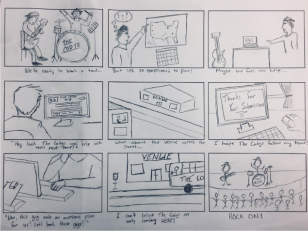
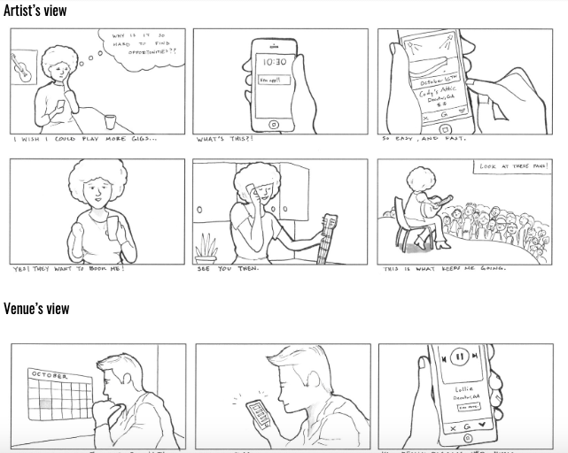
Storyboards helped communicate how the divergent solutions might play out in real usage scenarios
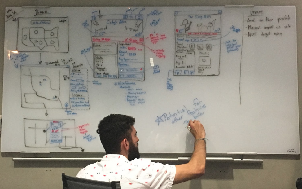
Bookr Direction
To make the concept comparison more rigorous, we documented the major design decisions behind each solution and tied them back to the research. This helped us evaluate the strengths and weaknesses of each direction more objectively instead of treating concept selection as a purely intuitive choice.
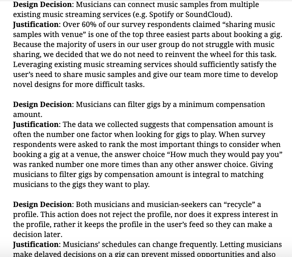
Documenting design decisions helped us connect each concept back to the research and compare the options more critically
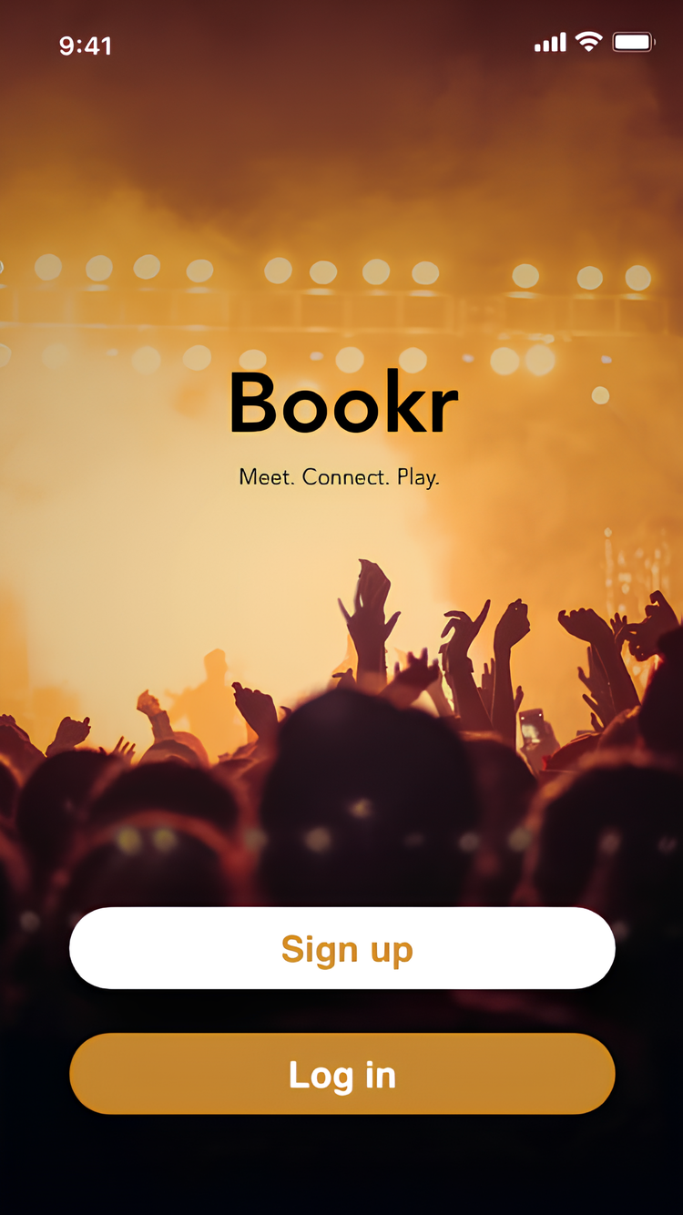
After gathering outside concept feedback, we determined that the direction with the most value and development potential was Bookr: a mobile application focused on connecting musicians with venues and improving the overall gig-booking process. Bookr stood out because it addressed the most immediate and recurring friction surfaced in research: the challenge of actually finding and securing gigs, not just managing music activity more broadly.
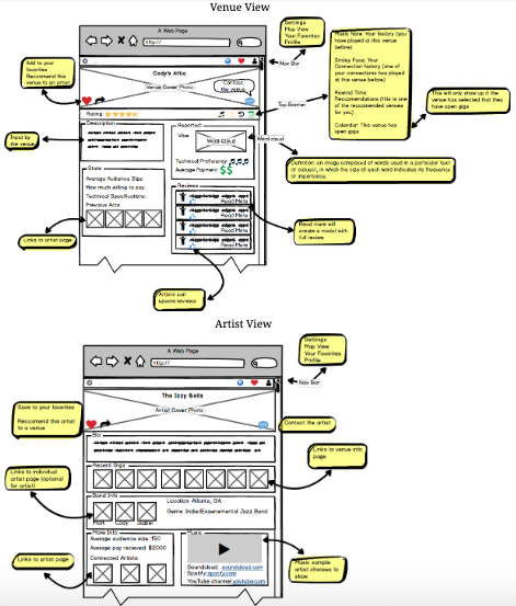
Once that direction was chosen, we moved from the broader concept space into high-fidelity design. The Bookr mockups fleshed out the original wireframes, defined a visual style, and created a more coherent end-to-end mobile experience that could support testing.
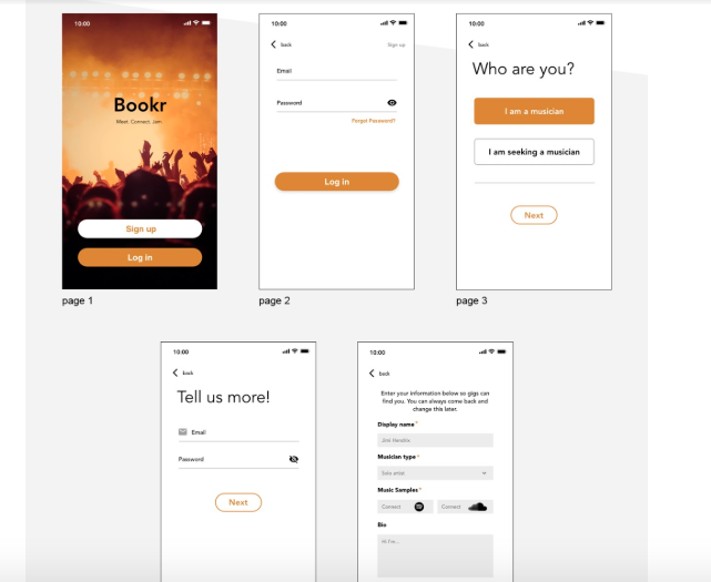
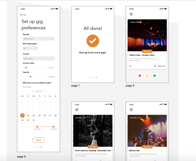
High-fidelity mockups brought the final Bookr direction into a more testable and communicable form
Prototype and Testing
We made the high-fidelity mockups clickable in Adobe XD so Bookr could function as an interactive flow rather than a static presentation. That allowed us to move into more structured evaluation planning.
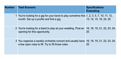
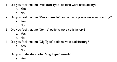
To prepare for usability testing, we created an evaluation plan with more than 25 usability specifications, along with scenario-driven tasks, post-test questions, and broader plans for future user and expert evaluation.
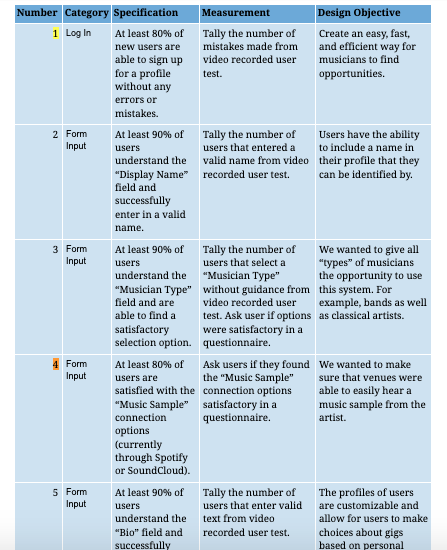
The evaluation plan translated the design into concrete usability questions and measurable criteria
We then ran usability testing with five participants, using realistic scenarios and a mix of quantitative and qualitative feedback collection. Participants worked through task-based flows, thought aloud while using the prototype, and completed follow-up questions after the sessions.
Scenario design and follow-up questioning helped us pair observed behavior with more direct user reflection
After testing, we reviewed the recorded sessions together as a team and synthesized both the quantitative results and qualitative notes into a clearer plan for future iteration.
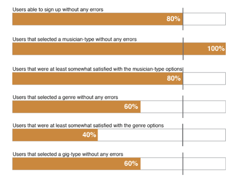
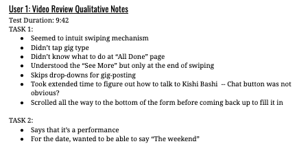
Reviewing both the metrics and the recorded sessions helped us identify where the concept still needed refinement
We also created and presented a poster summarizing the project at a design showcase. That gave us a chance to communicate the work publicly and explain the reasoning behind the final concept and prototype.
The poster presentation became a concise way to communicate the project’s research, concept direction, and prototype work
Outcome
The project produced a coherent end-to-end concept, a tested prototype, and enough momentum to suggest life beyond the class itself, even though the semester ended before another full iteration cycle.
The project also showed signs of life beyond the class. We submitted Bookr to the Georgia Tech Create-X startup incubator and advanced through two rounds of discussion and interviews. In parallel, two of the musicians I interviewed had recently started their own record label and were interested in carrying the concept further toward implementation.